

I am extremely excited to share this bedroom update with you. I know a few weeks back, I recently shared a bedroom update with you when I styled it. It technically wasn’t an “update” because nothing in the room was new. I simply just styled the area with different items all around our house. I tend to do that to make a space feel new again. This time, I actually do have something new to share with you!
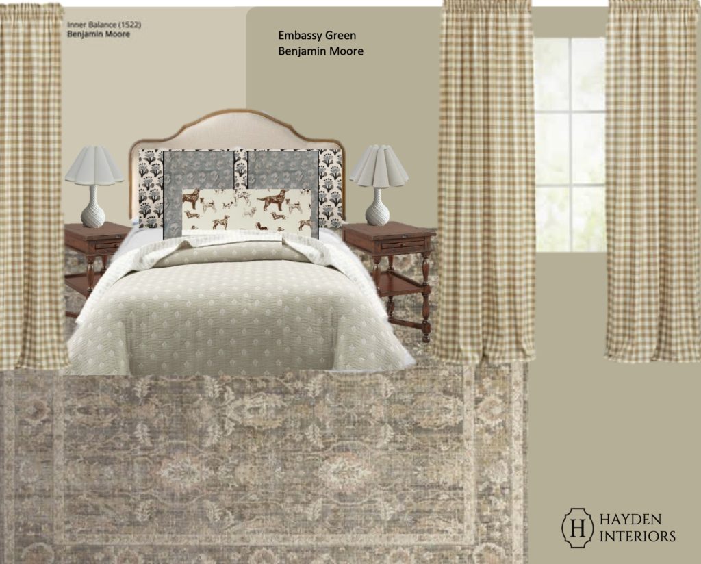
I wanted to make some minor updates in here as it has been several years since I have touched anything in this room. I knew I didn’t want to invest a lot of money into this room as it already has good bones. I just wanted to change out some textiles and paint colors. To begin, I worked on a mood board, this time specifically focusing on accent wall colors and patterns. This is a great place to start if you feel stuck or overwhelmed. If everything inspires you like it does me, it can be a great place to put it all down. Copy and paste all the things you are drawn to. Then from there, start eliminating the ones that don’t stand out to you compared to the others. For me, I really wanted to swap out our current curtains so I found this check pair as the starting point. Then I tried to find paint colors that accented the bed. The current color (metropolitan AF Benjamin Moore) is not bad by any means. It’s just not the look I am going for. I wanted something a tad warmer that would coordinate better with our bed and end tables AND still be a good fit with our new curtains.
CHOOSING THE PAINT COLOR
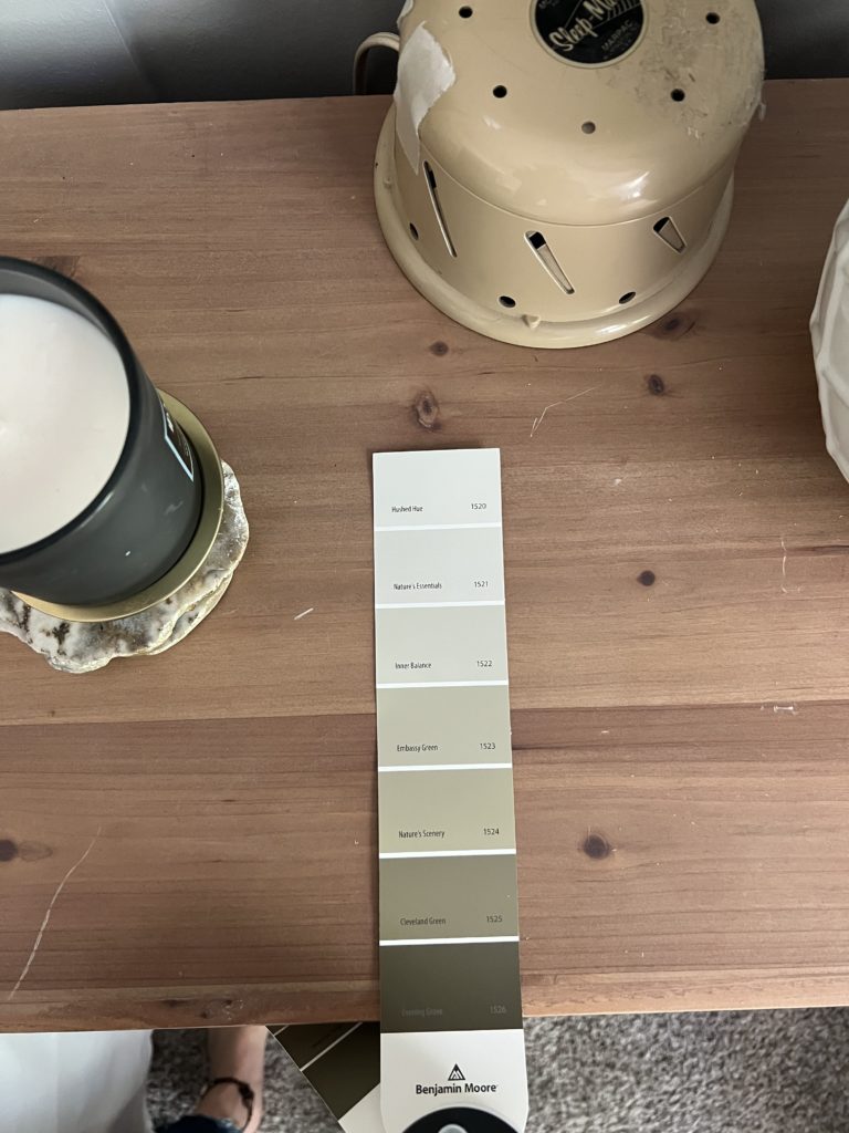
Choosing the paint color in here was a little more difficult than choosing fabric patterns. I knew I wanted a warm neutral that paired well with the dresser and bed, but I wasn’t sure beyond that. I played around for swatches for hours it seemed. I finally realized that if I found the darkest hue on the paint swatch first, then that sort of helped me narrow down which direction to go from there.
Since the bed and end tables are so similar, I knew it wouldn’t be an issue finding a color that went well with both of them. I finally found the paint card but I could not decide on if I wanted to go lighter vs darker. Inner balance was lighter and warmer than the current wall color which was a plus. But Embassy green was darker and gave more color and contrast to the bed.
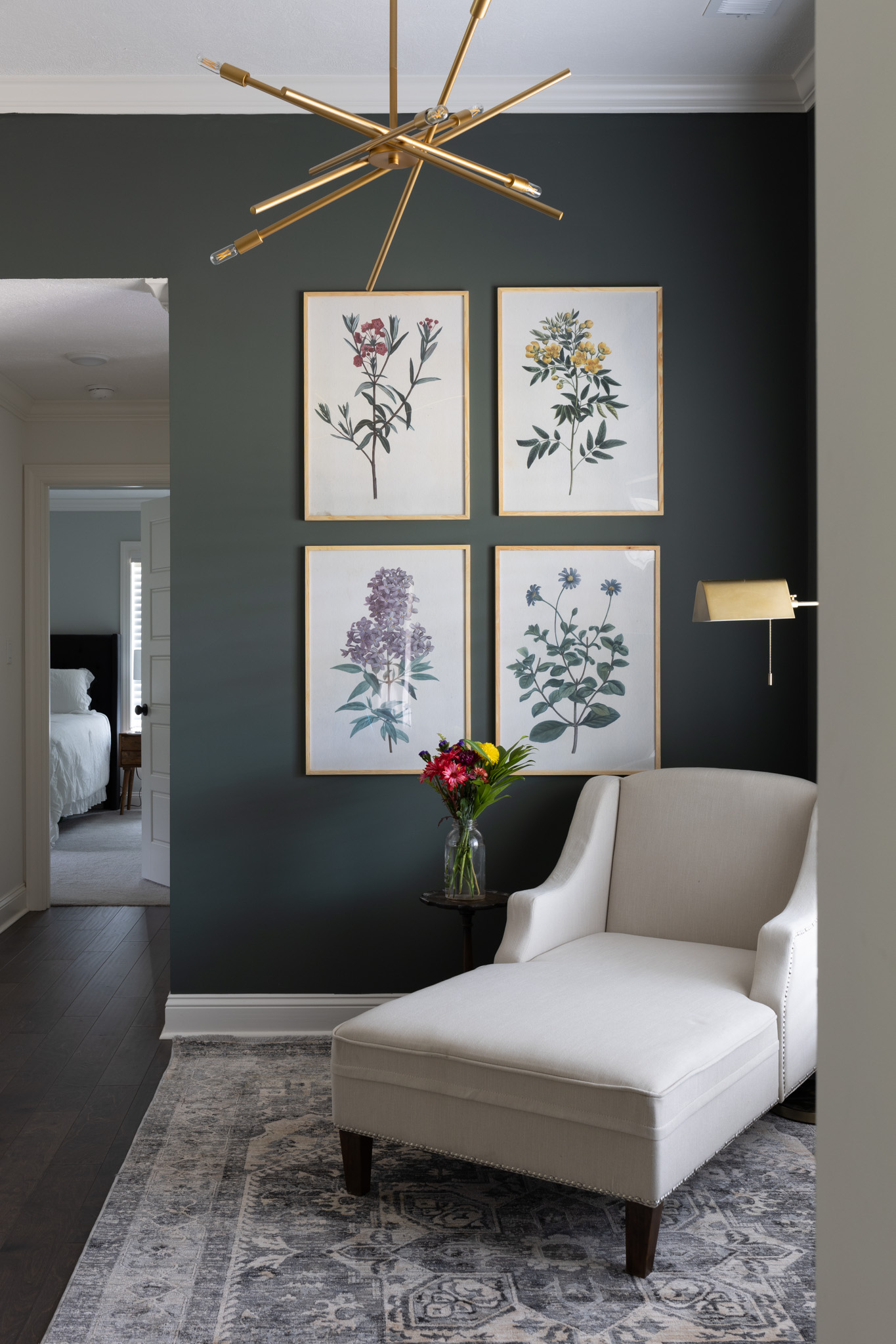
PRO TIP: when you are deciding between paint colors, pay attention to the LRV: Light Reflective Value. Light Reflectance Value, refers to how light or dark a paint color will look on a scale of 0 (black) to 100 (white). The current color: metropolitan AF LRV is 49.96. Inner balance is 56.38. Embassy Green 41.96. This actually helped me because I knew that choosing embassy green would mean the wall would be darker, which I did not necessarily want.
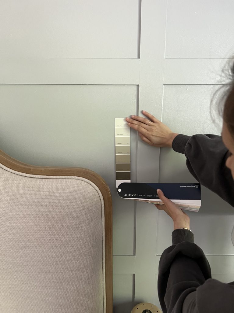
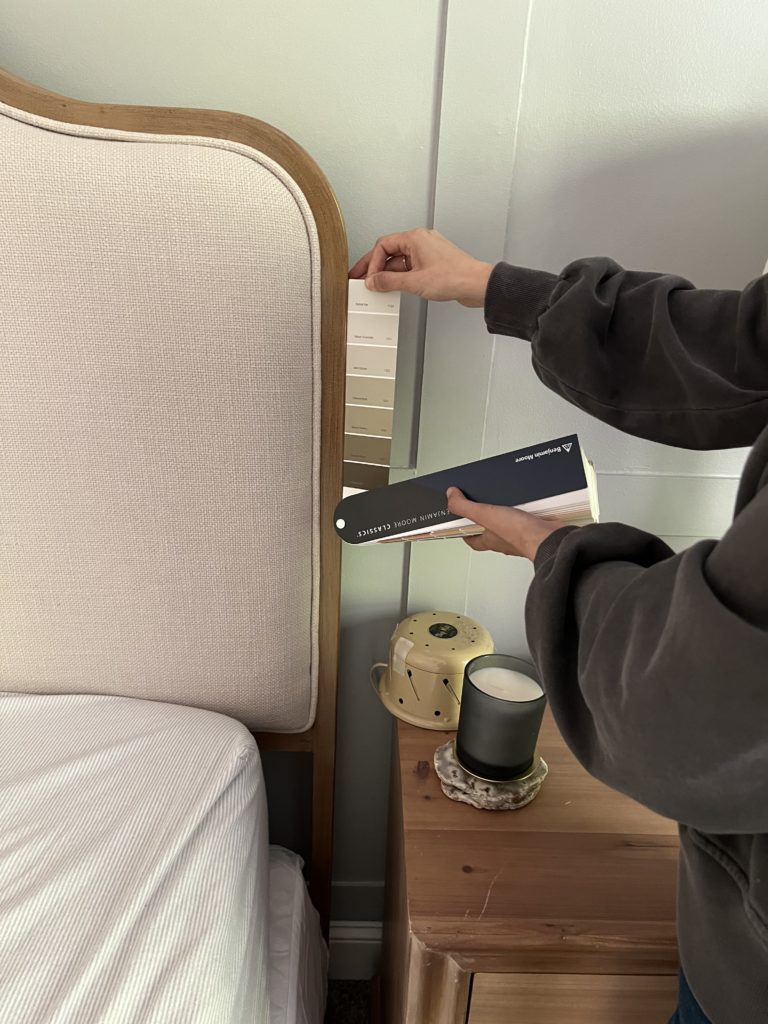
I placed the swatch in natural light against the bed, dresser, and fabric. In some lights inner balance made the upholstered bed appear pink, which I did not like.T o help end my indecisiveness, I ended up going to home depot and getting a $5 sample of BOTH.
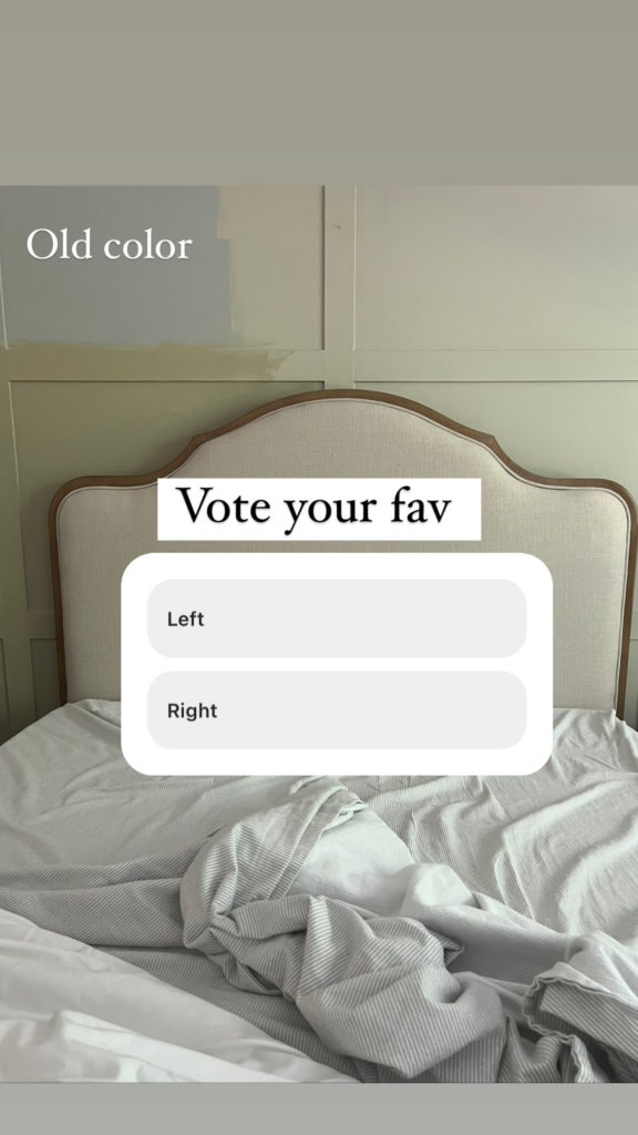
When I applied the sample of each, I immediately knew which one I was drawn to more, BUT I wanted to make sure with you guys. I asked you all on instagram and the majority said INNER BALANCE! I LOVE the way it brightened up the room just a tad and added a touch of warmth that the space needed.
FINDING MY INSPIRATION
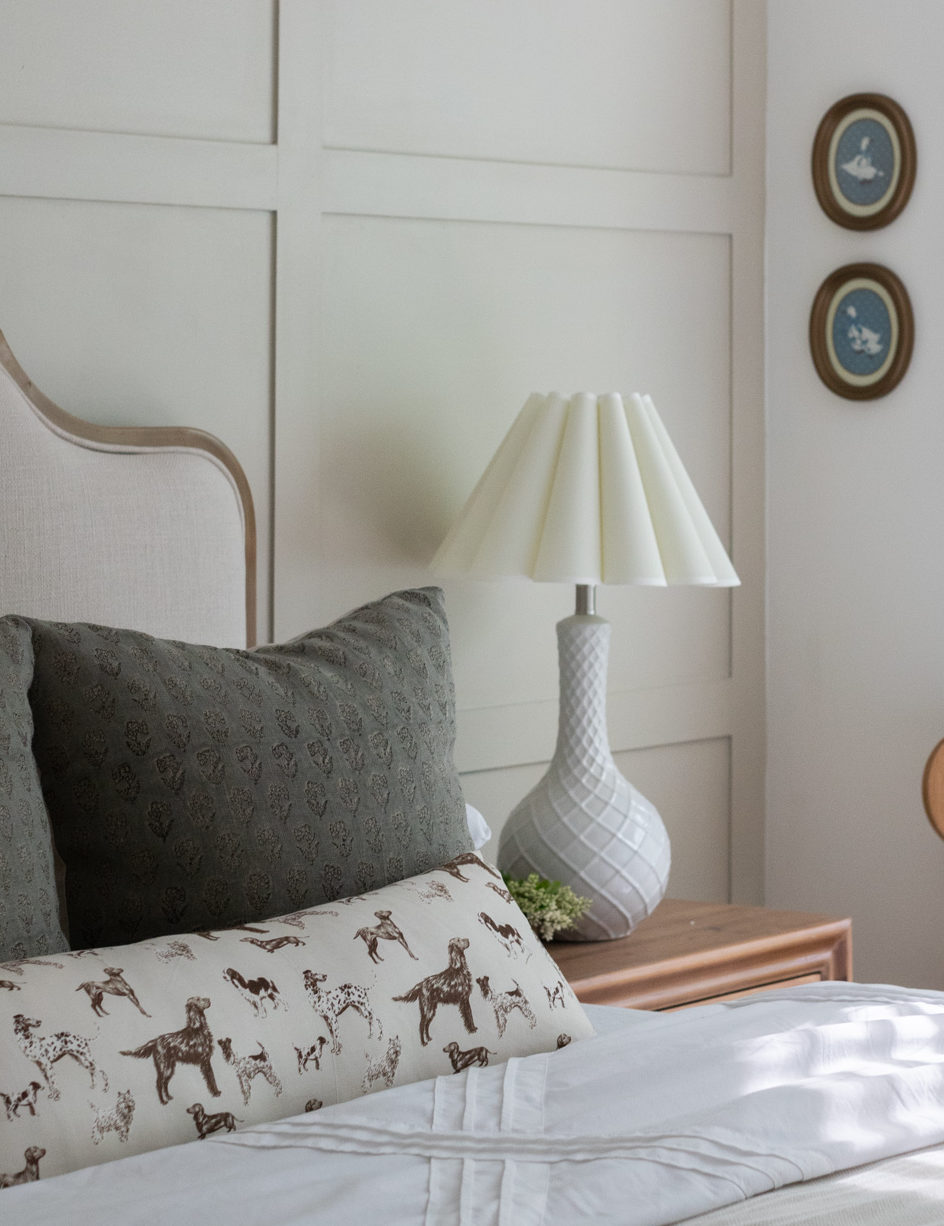
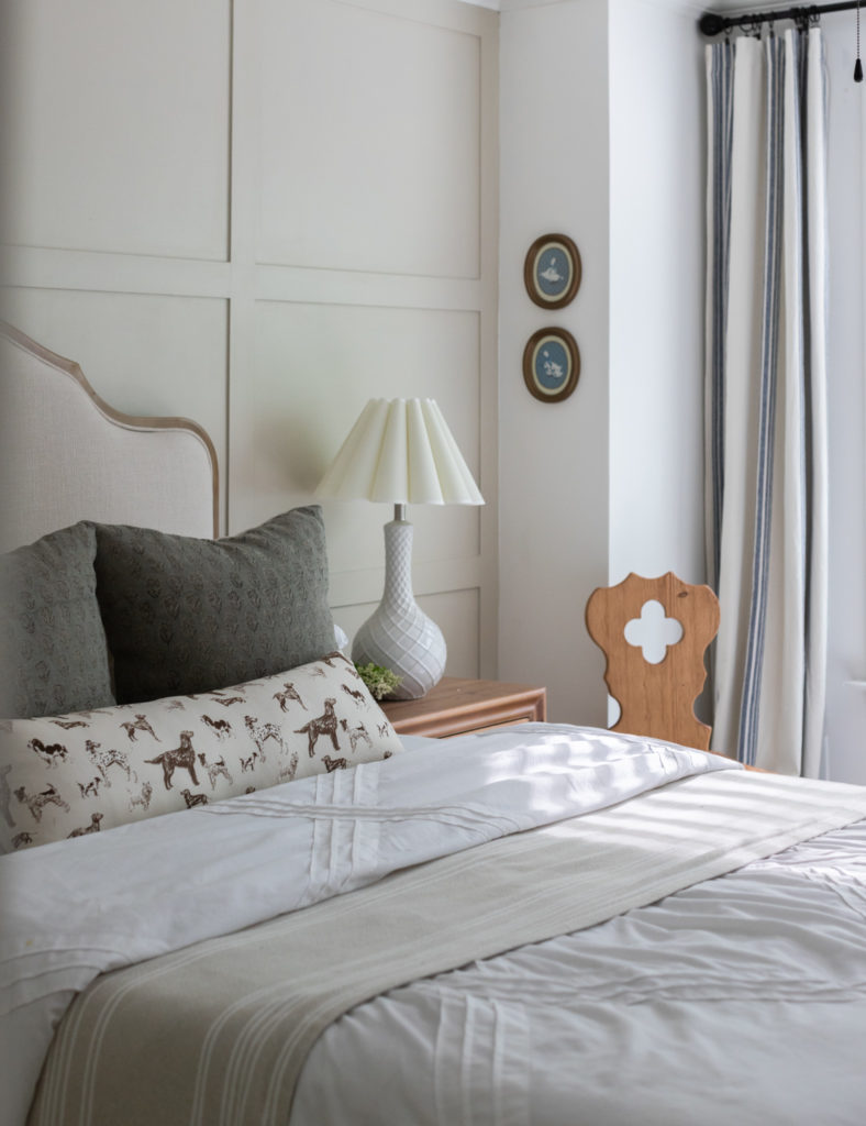
Believe it or not, the inspiration for the room started with the fluted lampshades. They are so unique and the curves on them remind me of scallops and I LOVE scallops. By the way, swapping out lampshades are a great way to personalize your space. From there I knew that I wanted to have fun and push myself creatively with patterns.
CHOOSING MY PATTERNS
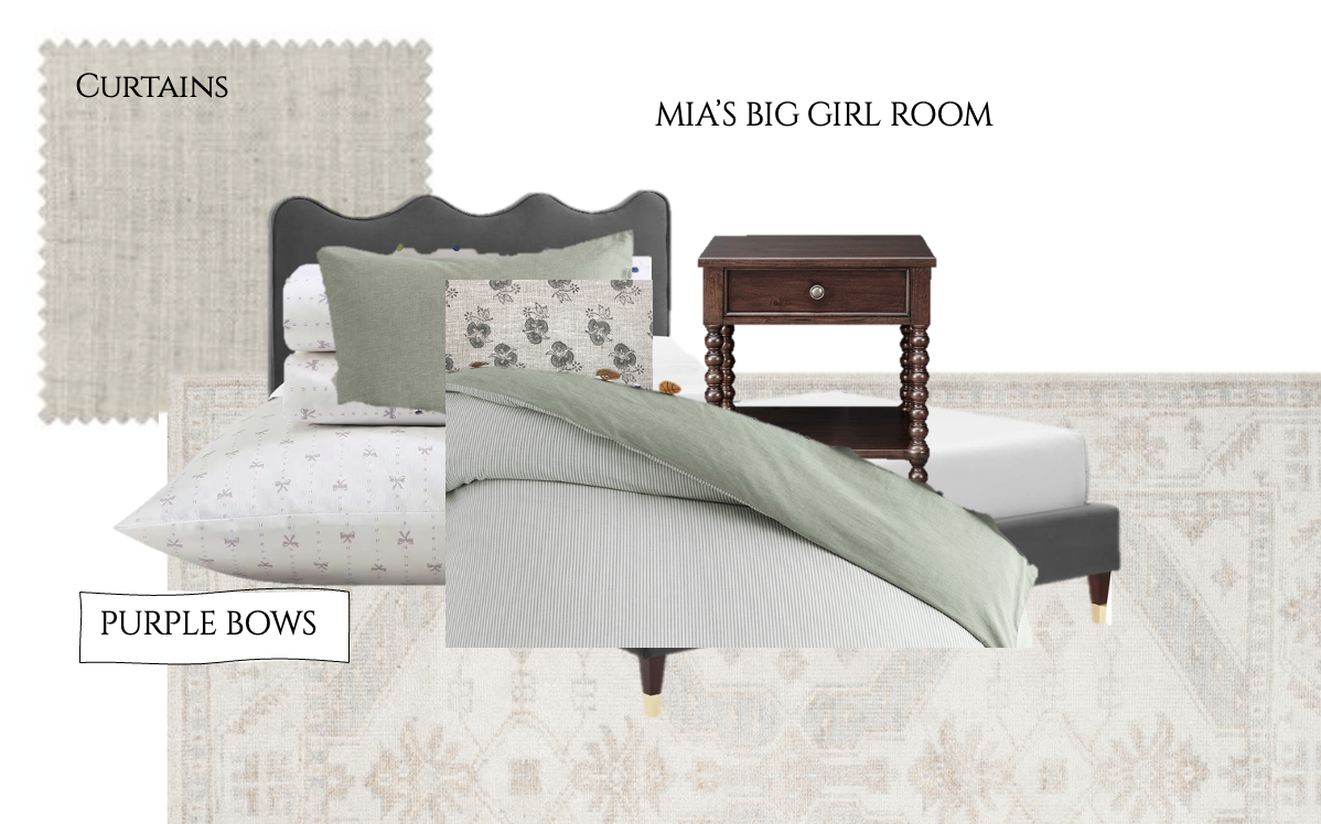
I knew from the get go that I wanted to incorporate a vintage puppy dog fabric. I was inspired when I saw a designer on instagram (Can’t remember who) use a horse print! I like horses, but I LOVE puppy dogs so I felt like that was the perfect opportunity for me to slide that in. I found the absolute perfect print from etsy. It wasn’t stark white which I love and it wasn’t black which I love. The perfect brown & off white coloring. While I do love all things vintage, my mood board was feeling a bit “old” with the check curtains, fluted lampshade and vintage puppy dog print. So I knew I wanted to bring in some “newer” elements. I felt like a block print fabric was the perfect way to bring in the touch of new. It would also be a really fun way to add color to the space. From my mood board here, I designed it with two block prints. I bought both block prints, but only ended up using one of them.
TIPS FOR PATTERN PLAY
I wanted to also share some tips I learned when I was playing with fabric patterns. First, don’t stress! Pattern play is supposed to be fun, so if it stresses you out, try to back up and take a different approach on it. There are no rules, but here are some general guidelines that helped me when figuring out which patterns to pair together.
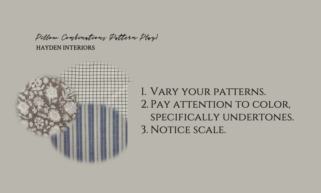
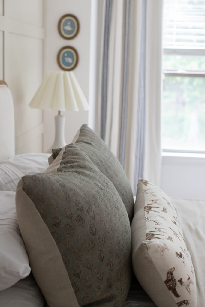
- Vary your patterns. After all, this is the whole point of pattern play!! Don’t be too strict with it. For example I tried to be intentional about mixing a check or stripe (or both as shown above) with a more irregular / abstract pattern. For one of my prints, I try to push myself with a fun, unexpected print fabric. The key to making all these feel cohesive is in the colors which I go over next.
- Pay attention to color, specifically undertones. This is where I’ll have fun! You can either go monochromatic or pair colors opposite the color wheel. There are undertones in all prints and I try to make sure they are all similar. Mainly regarding white prints. That is the easiest way to tell something doesn’t go together. Try to make sure the whites match or at least have very similar undertones. You don’t want a crisp white fabric with a yellow/off white fabric. One of them will look off.
- Notice scale. If you have a really small scale fabric on a big pillow, the actual pattern can sometimes be missed, or you have to squint to see it if you know what I mean. Likewise if you have a really large scale fabric on a small pillow, then that looks off too. I like to use larger prints on larger pillows and smaller ones on smaller pillows. Not always but that is a general guideline. If one pattern is dominating or tends to be really strong, I tend to put it in the back of my pillow combinations so that the front pillows can cover it up a bit. These are not rules by any means but it may help steer you in the right direction.
PILLOW COMBINATIONS TO THINK ABOUT
SHOP PILLOW COMBINATIONS HERE

BEDROOM SOURCES
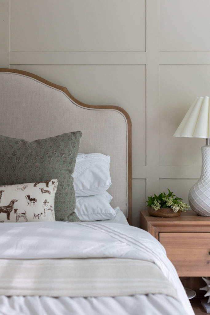
BED | DOG PRINT | STRIPED PRINT | BLOCK PRINT
Disclaimer: This post contains affiliate links. I may receive a small comission for purchases made through these links at no extra cost to you. Just click on the bold links.
I didn’t get a chance to use my striped pattern linked above because I liked the simplicity of those two patterns. If you still want to use patterns, you could incorporate it into other elements in the room like curtains or diy custom lampshades!
Please also know this was my first time playing with patterns so please don’t count me as an expert. I have always stuck with my typical solids and stripes pairing but wanted to push myself creatively for a bit. If you have any questions or need help with sources please reach out to me! I’m HAPPY to help.


Where we discuss all things design, obviously.
DESIGN
Browse Category
For more of our latest projects, follow along on instagram at @hayden_interiors
© Hayden interiors 2021 | design & Photos by Sara Hayden
Intentional Design for Beautiful Spaces
Jackson, Tennessee
+ Show / Hide Comments
Share to: