

Our 9 Best White Paint Colors
Today on the blog I’m sharing the best white paint colors for every home. You would think that white paint = white paint so it wouldn’t be difficult choosing one for your home right?! WRONG!! Choosing the right white paint color can be very tricky! There are so many factors that play in like undertones, sheens, and even color variations between certain brands can be misleading so let’s dive in! I have done some work and narrowed it down to 9 that I truly think would look beautiful in any home.
BM Swiss Coffee (OC-45)
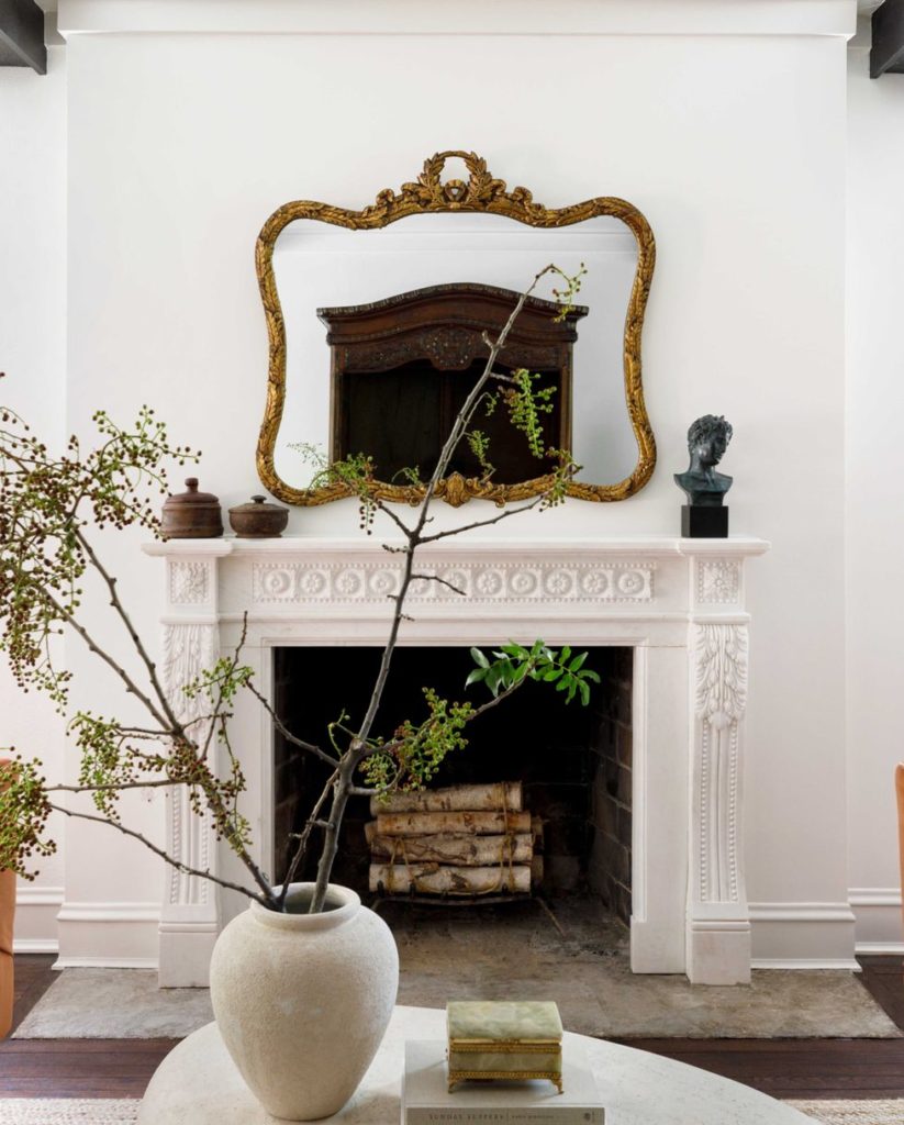
- I think this specific color became really popular when Shea McGee used it on the interior walls in her home. It never really was on my radar until her honestly, but man, I was missing something for not knowing about this specific white. It is described as a warm white that plays well in traditional spaces. It compliments golden hues. We have this color on our dining room walls currently. It photographs really beautifully too.
BM Chantilly Lace (OC-65)
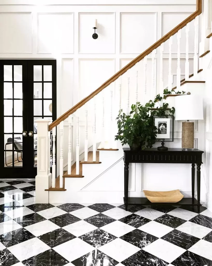
- Chantilly Lace is a very nice, bright, crisp white. Lots of reviews describe it close to a pure white. If it were to have an undertone, people would say it would be blue. It’s great on walls, ceilings, and trim which makes it an easy yet versatile choice. You can check out a great review of the color here.
BM White Dove (OC-17)
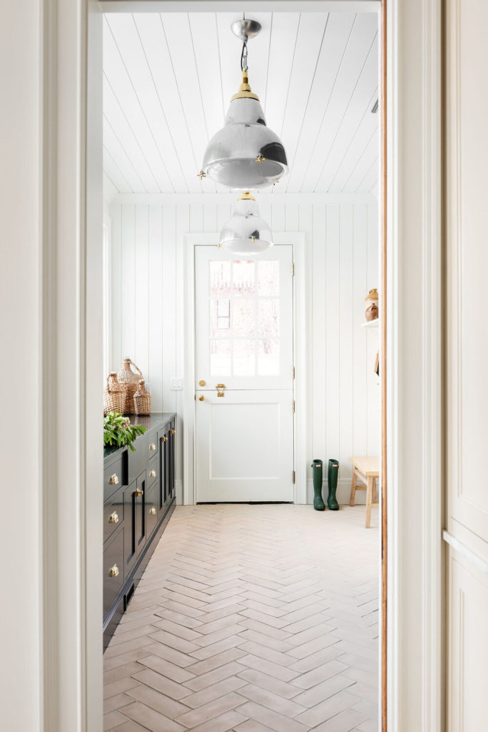
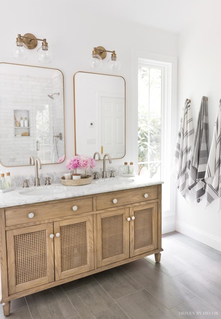
- This color is considered a classic. Benjamin Moore describes it as a softly, shaded white. It is not considered a pure white since it is described as being more creamy with gray undertones. This is a great choice for trim and walls and areas with lots of natural light.
SW Snowbound (7004)
- Snowbound is described as a warm, soft white. If you have south-facing light, you may find it looking that bit warmer, leaning more into its undertone. If you have north-facing light, it will mute a bit without looking look icy cold or stark. All in all, it is great for trim, walls, ceilings, or cabinets.
BM Simply White (OC-117)
- Described as a crisp, off white, it was once Benjamin Moore’s 2016 Color of the year and for good reason. It’s one of those colors that looks warm when paired with warm tones and cool when paired with cool tones.
BM Super White(OC-152)
- A brilliant, almost sparkling white, this clean shade suggests clarity and simplicity.
BM Cloud White (967)
- Benjamin Moore Cloud White is a subtle off-white that gives any space just the softest glow. But be careful not to confuse it with BM White Cloud (2159-70), which is a different color with a very similar name.
SW Alabaster (7008)
- “Alabaster is neither stark nor overly warm, but rather an understated and alluring hue of white.”
Farrow & Ball All White (No. 2005)
- Clean, bright and fresh without feeling too stark.
TIPS FOR CHOOSING A WHITE PAINT
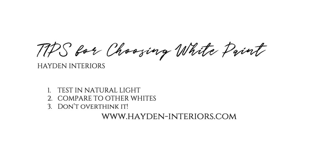
- Test in natural light. Grab a small sample size from your local paint store. Put a sample in different parts of the room. See how it looks at different times of the day.
- Compare these samples to other whites. Sometimes putting it next to another white eliminates the whites you don’t want.
- Try not to over think it! Lots of times I see people struggling to make a decision because they don’t want to make the wrong one. That was me for years! Now my approach is the only wrong decision you can make is failure to make one at all. Try not to worry about that “failing” because at the end of the day, it is just paint and it can be fixed!
Final Thoughts
White paint can be tricky, BUT it doesn’t have to be. Narrow it down to a few so you don’t get overwhelmed. Put several samples on the wall and check on it throughout the day. If you need to, don’t be afraid to paint an entire wall to see how you feel about it. Sometimes it’s hard to know from one small sample size. If you are trying to match existing trim in your home, then my suggestion is to use the exact paint color AND brand. Use EXACTLY what they used. Just because your walls are Benjamin Moore swiss coffee doesn’t mean Home Depot color matched to BM Swiss coffee will be the same. And most importantly, don’t overthink it. All white paints are beautiful and if we are being honest, all white paints will eventually yellow on your wall so try not to sweat it! Reach out to me if you need help. I truly believe not making a decision is the only “wrong” decision you can make!

Where we discuss all things design, obviously.
DESIGN
Browse Category
For more of our latest projects, follow along on instagram at @hayden_interiors
© Hayden interiors 2021 | design & Photos by Sara Hayden
Intentional Design for Beautiful Spaces
Jackson, Tennessee
+ Show / Hide Comments
Share to: