

Powder Bathroom: Paint + Vanity Sneak Peak
Powder Bathroom Progress: Paint + Bonus Vanity Sneak Peak. Whew! What a whirlwind of a week! I’m not even sure what day of the week it is. I was doing pretty good keeping yall up to speed on everything happening on our powder bathroom, but somewhere along the way I managed to drop the ball!! BUT I believe we were at deciding a paint color for our powder bath!! And if you don’t know it now, not only did we decide on a paint color, but it’s PAINTED!
If you are new following along, let me begin by saying we are remodeling our powder bathroom. We started planning this project the very beginning of July and we are one step closer to the finish line… which is still probably a month away. You can read our first powder bathroom post here. Once you’ve read that, you can read about the floors here.
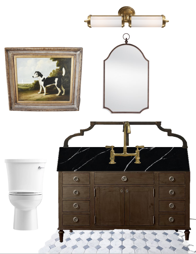
Here was my original mood board from July.
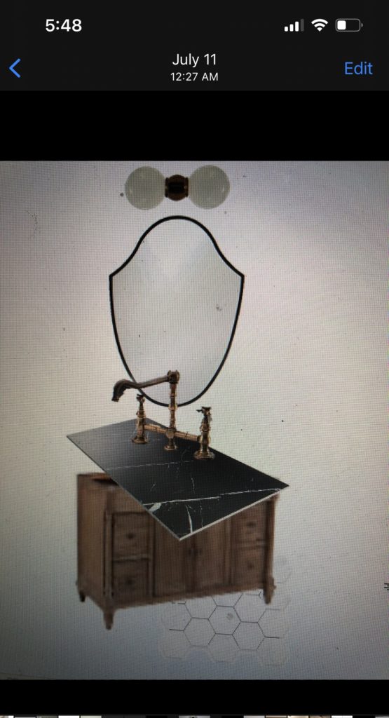
And then it was modified to this in September.
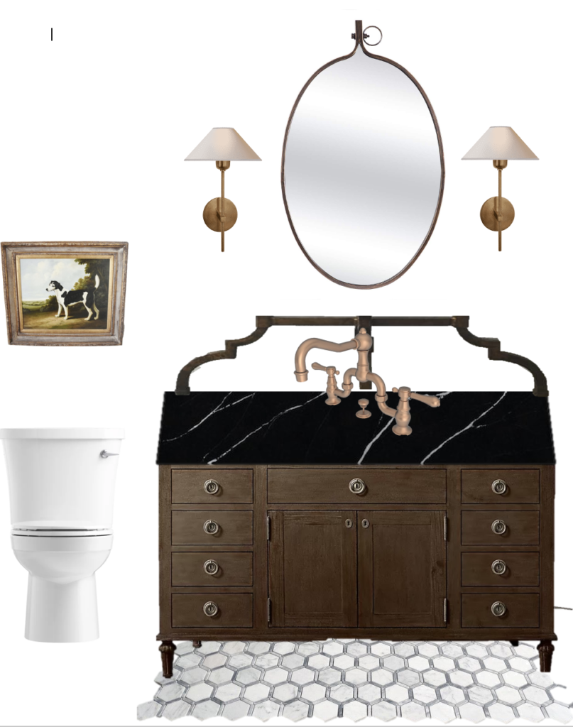
After starting the project and getting down to the nitty gritty, I “had” to tweak the board even more. (More like wanted to tweak the board!) Here is the mood board from early December where I decided to do double sconces to spread the lighting more evenly throughout the room. Notice how it just keeps getting better!

Let’s Talk Paint Color
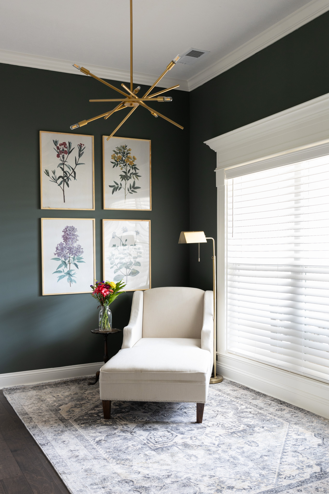
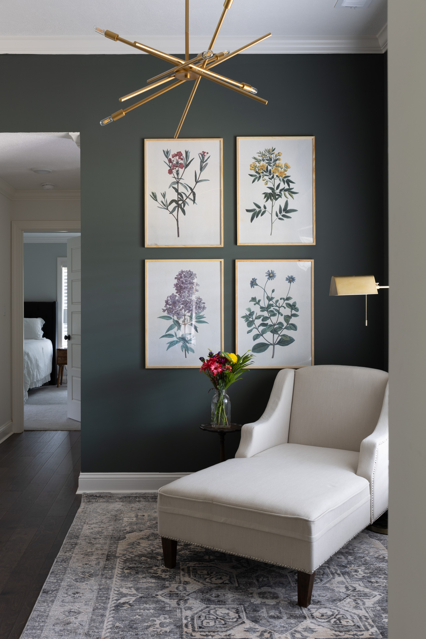
Now for the fun part! Let’s talk paint colors. Really and truly this was the easiest decision of the whole room for me. Honestly choosing the grout color was WAY more painful to me. I knew early on that there were two directions I could go in here, but wasn’t 100% sure which way I was leaning. Dark and moody or light and bright.
When I talked with Will, he told me immediately to go light and bright. I showed him several inspiration pictures back in July and all the pictures were light and bright. When I mentioned to him that I was actually thinking about going dark.. like dark, dark, he wasn’t on board. Could I talk him into it?! Our house has an open floor plan and eventually I want all the main areas to be white. Right now, our hallway off of the powder bathroom, kitchen and breakfast area are all white.
If I was going to be putting this much work in a bathroom, and if all the other areas in the house near this bathroom are white, I wanted walking into this bathroom to be a different experience. I have played around with dark paint before in our home, but I could never get it quite the way I wanted. The spaces always felt a little bit too modern or edgy for me and I ended up changing it back to something neutral. I knew this time I could balance out the modern feeling this time with the vanity. It would bring the perfect amount of traditional back into the space for me.
So how did I choose a paint color out of thousands of colors out there?
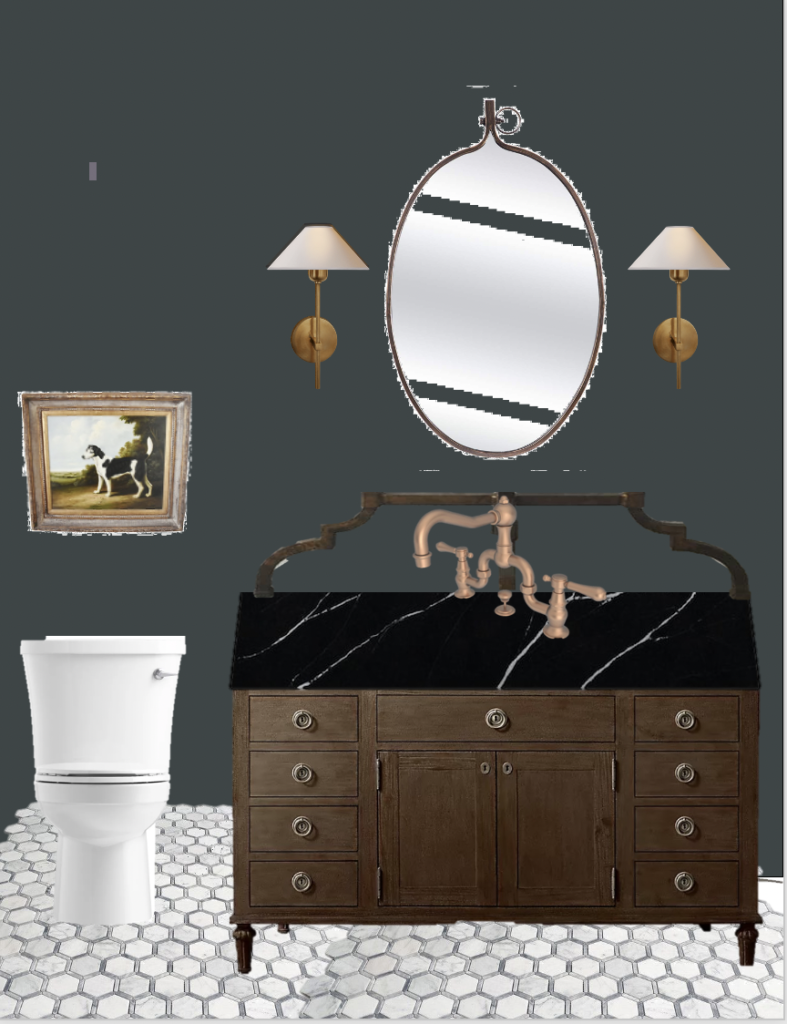
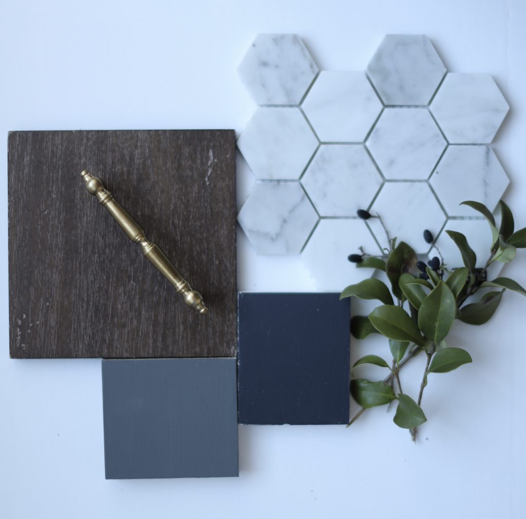
Very easy actually. First I started with a mood board as seen above. I inserted various paint colors with all the other elements to see what looked best. I tried a gray/green, gray, taupe color, and navy. I was down to gray/green, navy, or dark gray. I elimated gray/green because we already have that in our laundry room. So I was down to navy or dark gray. Then I thought, why don’t I just combine the two colors and do a dark gray with maybe a blue undertone?! And that’s exactly how that color came to be. But how did I decide on the actual paint color?!
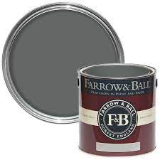
I hate to tell you this secret because then, what is the point of hiring a designer but here it is. Use Farrow and Ball colors. I feel like they hit the jackpot when it comes to paint colors. Most paint brands have a swatch and it has 5 different colors to choose from off of the swatch. Overwhelming! Farrow and Ball has less paint colors to choose from which makes it easier if you know the general mood you are trying to go for. When it came to choosing colors, it was actually quite easy then! I found Farrow and Ball’s website and came across “Downpipe” and immediatlly loved it. It was a dark gray but appeared navy in some lights. EXACTLY what I was going for. .
Last minute before running to pick up the paint I started to doubt myself and I decided to get ONE more sample color just in case that leaned too gray for me. This time I wanted less gray and more navy if that makes sense. That is where I found “Railings” by Farrow and Ball. Surely I would like something out of these two!
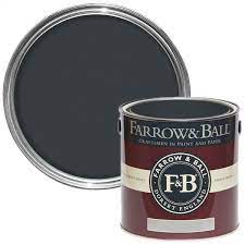
We do not have a Farrow & Ball in town so I took it to Sherwin Williams with the hopes that they had this color in their system to match for me and BINGO! They had both!! Side note other designers will claim that there is a discrepancy in Farrow and Ball vs color matching Farrow and Ball. They say that you can tell a difference but I honestly didn’t care! I knew it would be close enough for me to still like it. I got a quart sized sample (smallest they had) in flat sheen because I knew that I could use whatever sample I chose for painting the ceiling.
How Did I Choose Between the Two Colors?!
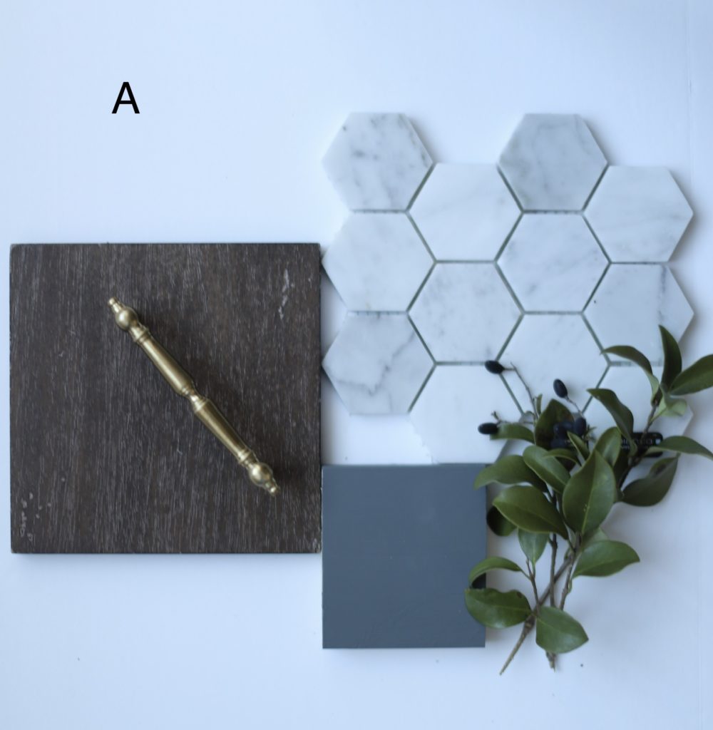
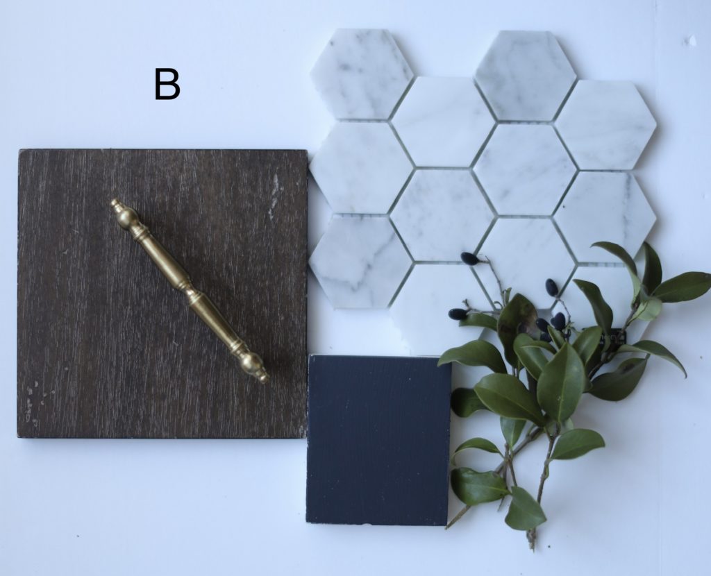
I took them home and decided to paint a sample of each on a scrap piece of wood.
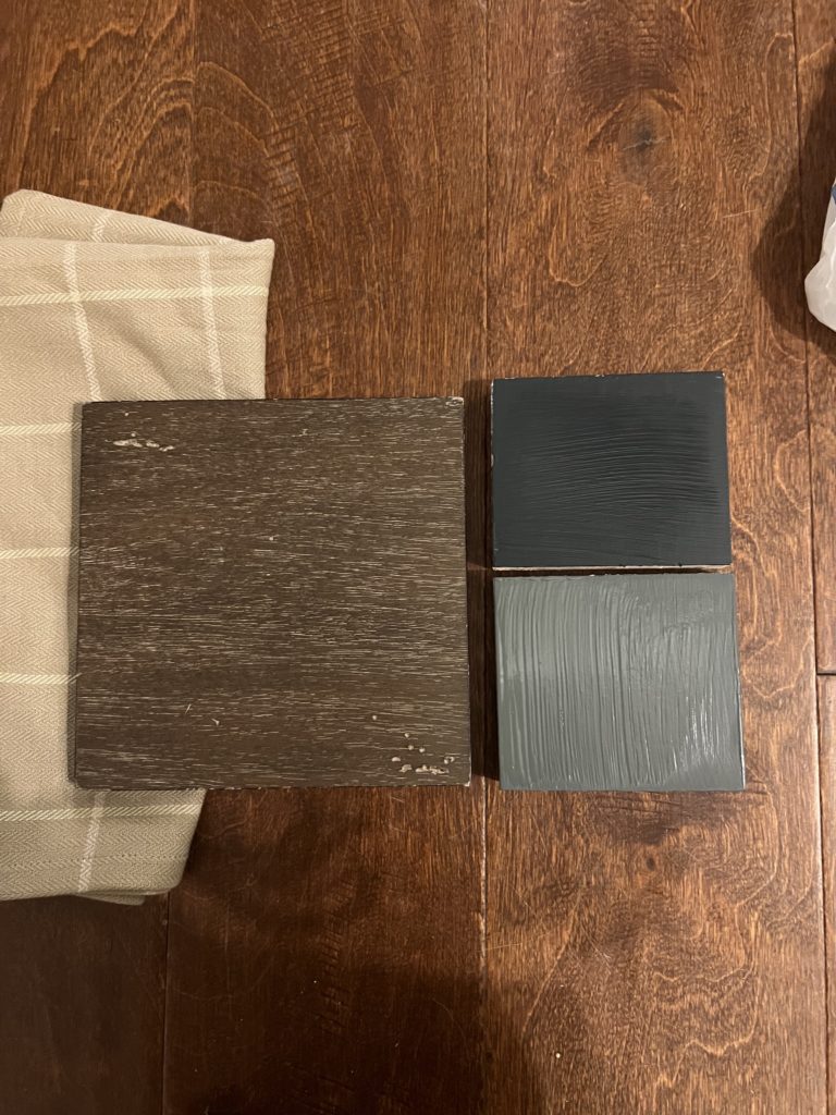
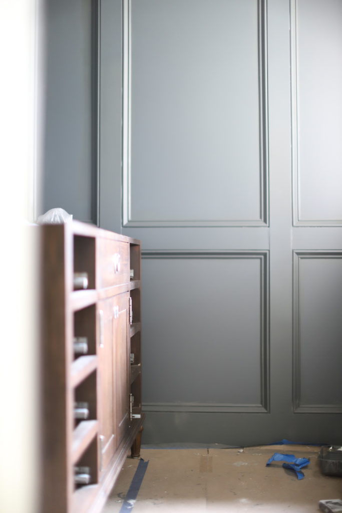
Believe it or not, my initial gut reaction was that I loved the darker navy “railings” better. It looked tooo good with my linen towel and I think I got fixated on that. But only for a split second! Then I realized I was being really dumb comparing it to the towel because that isn’t a permanent piece of the room. After removing the towel from the picture, I realized that there was a greater contrast between the wood and the paint if I went with the lighter gray- navy “Downpipe.” Which means that the wood would stand out more, which is what I wanted! Also picturing this combination with BLACK countertops, the lighter paint contrasts it better. With the darker navy “railings” it seemed as though the black countertops would get lost in the wall paint color around it and not be as special.
Will was dead set on downpipe from the beginning (after I convinced him not to go white.) He never wavered in which one was his favorite. Then I decided to take the sample to the bathroom and see how it looked in comparison to the floors. This is a horrible picture quality, but it was with this picture that I 99% made my decision. Check it out!!
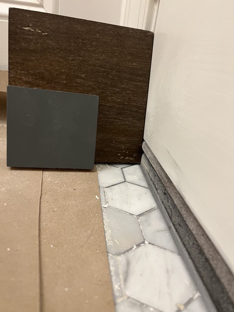
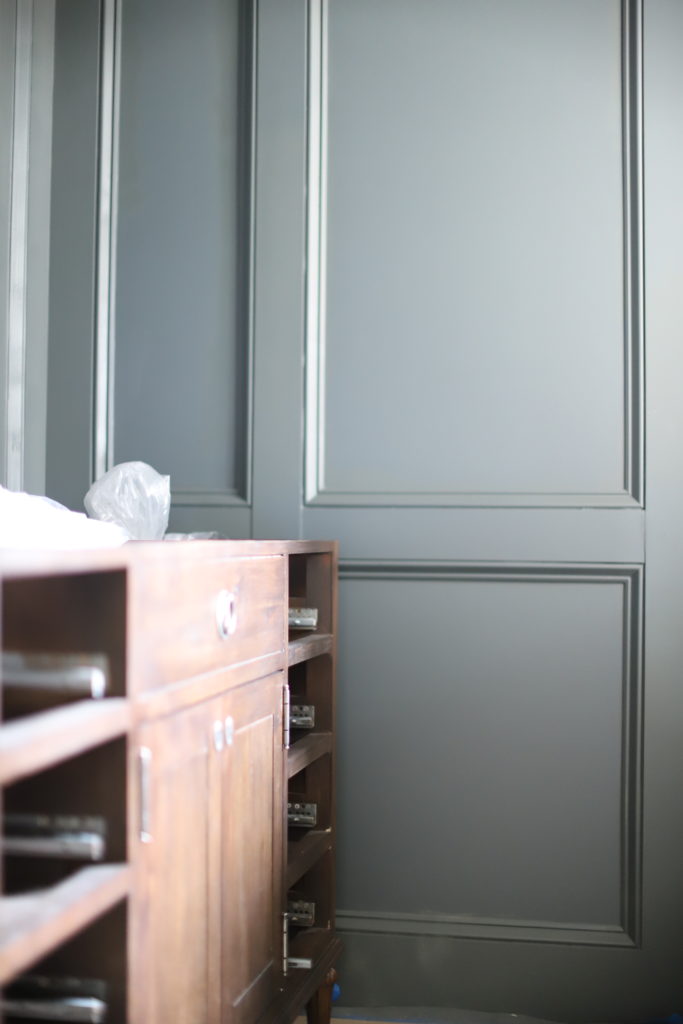
As you can see the marble floors + the wood + the paint color + the grout color…yes, the grout color = magic. I truly was speechless seeing this combination. It was here that I decided A (downpipe) was my favorite. And believe it or not, it was the grout color next to the paint that sold it for me. Look how well the grout color accents the marble AND the paint! It looks like it truly was meant to be there all along. It looks as thought I pulled a color from that grout and put it on the wall.
I definitely didn’t do this on purpose but I love when I get happy accidents like this!I got sooo lucky deciding to go darker with the grout and you can see here that EVERYTHING plays such an important role in design. Most experts I called told me to go with a warm gray grout. Let me tell you, this paint color would not SHINE the way it does using a warm gray grout…
Then I brought it to you guys to decide the next day and well, you guys mostly picked A too!!!!!! DECISION MADE! Thank’s for helping confirm my decision and helping this indecisive girl make some big decisions…
BUT WAIT! LET’S SEE THE PAINT IN THE ROOM!
And the moment you all have been waiting for…
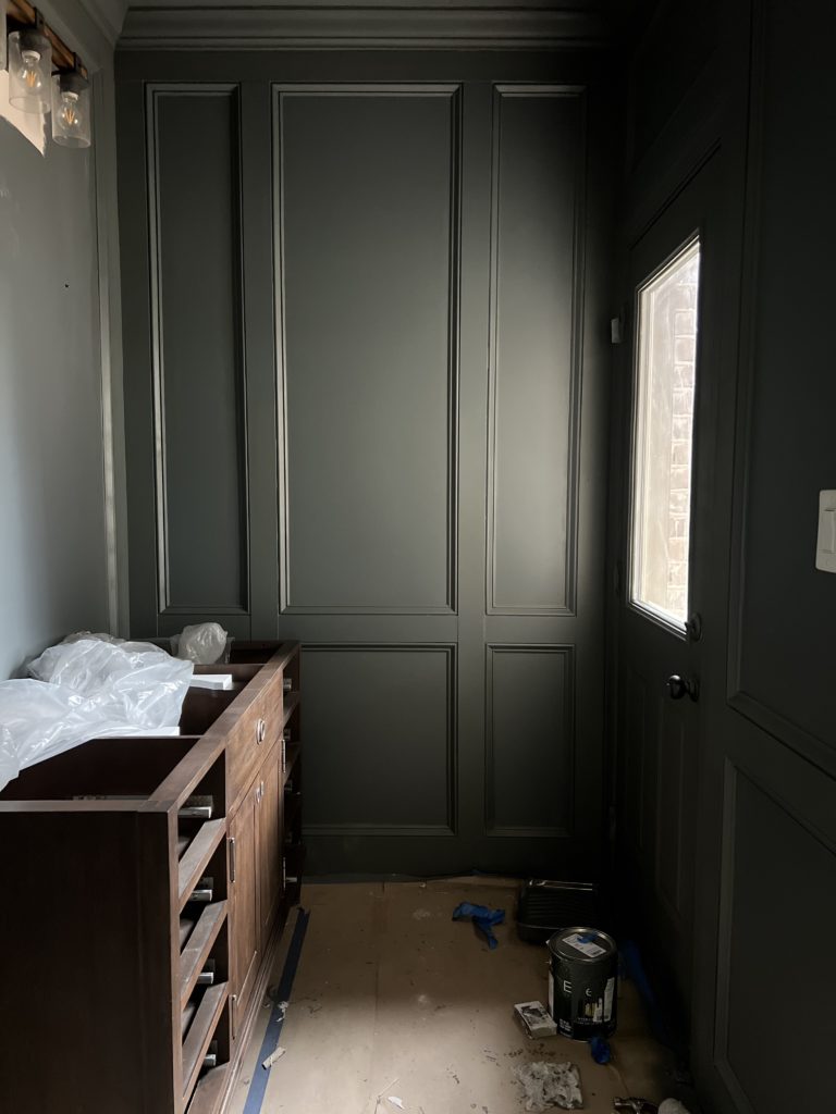
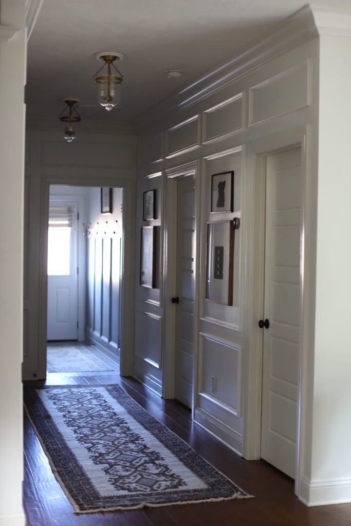
I absolutely love everything about this paint color. In daylight it looks darks gray with a tiny hint of navy. In total darkness it looks black. It also looks dark gray with no blue in some lights. First picture was taken in broad daylight. Last picture was taken in afternoon light. All unedited photos using only natural light.
Now that we have paint completed, it’s time for lights, mirror, and countertop! Almost there!
As always, thanks for following along.

SEE MORE
- The Day We Discharged
- DIY TABLETOP CLOTHES HANGER BABY SHOWER DECOR
- Low cost, low waste Baby Shower Decor
- Mia’s Big Girl Room
- USING LARGE SCALE ART

Where we discuss all things design, obviously.
DESIGN
Browse Category
For more of our latest projects, follow along on instagram at @hayden_interiors
© Hayden interiors 2021 | design & Photos by Sara Hayden
Intentional Design for Beautiful Spaces
Jackson, Tennessee
[…] Powder Bathroom Window Treatments Powder Bathroom Progress: Paint + Bonus Vanity Sneak Peak Powder Bathroom Progress: How We Chose Our Marble […]