Why we changed our laundry floor plans.
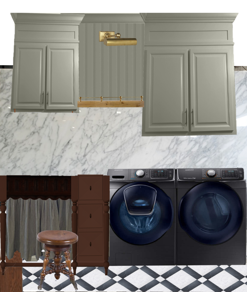
We changed our laundry floor plans. If you are just tuning in to our laundry room makeover, I have been planning to do a harlequin checkerboard pattern on the floor. It’s basically been a part of the initial plans since the beginning. But when we recently decided to do our pool patio pavers in a harlequin checkerboard pattern too, I sort of started feeling unexcited about doing the checkerboard pattern in the laundry room too. Will mentioned it and asked if I was still planning on doing that in the laundry room not knowing I already had hesitations about it. That was enough questioning to make me reevaluate our plans.
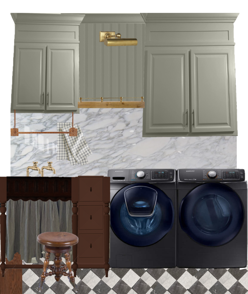
Don’t get me wrong I still LOVE the harlequin pattern. It’s always had my heart ever since I started dreaming of the laundry room remodel. Recently I got on stories and asked you all whether you thought it was timeless or a trend. I think it’s both. I think it is a timeless, classic pattern that has been around for centuries in design, but unfortunately I do feel like it is reaching a popularity right now that makes it feel less special. My love for checkerboard runs deep so this decision to change was not easy. And I had to sit and truly think about what I want. For me, pushing myself creatively and having something unique and special to us was more important than the beauty of this classically beautiful pattern.
CHOOSING THE PATTERN
To figure out what I wanted, I had to sit and think about things. I started by finding every black and white pattern I could find and studying it. There are only a small handful of b&w patterns that I felt were timeless and not too busy. I studied this one below for awhile thinking this could work.
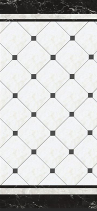
I know this is a classic look and while I do love the pattern, something about it just wasn’t speaking to me. We would’ve had to buy our own tile and cut each piece down to size OR order this from the UK which isn’t in our budget. It was actually while studying this pattern and realizing what I don’t like about it that led me to finding why I DO like the checkerboard pattern so much.
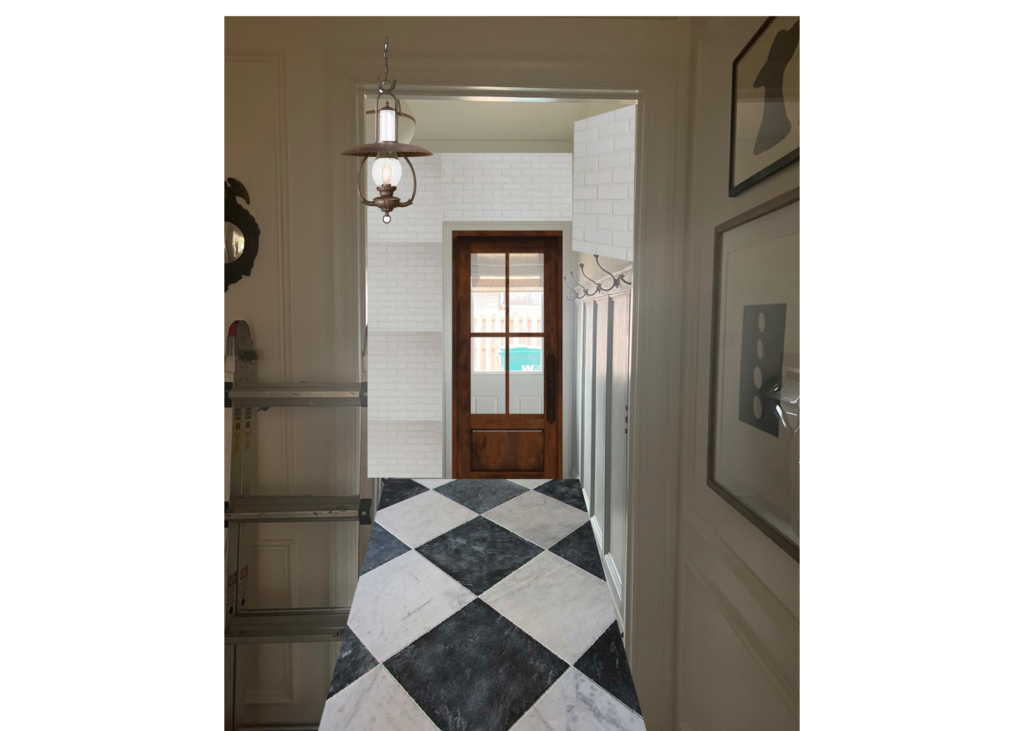
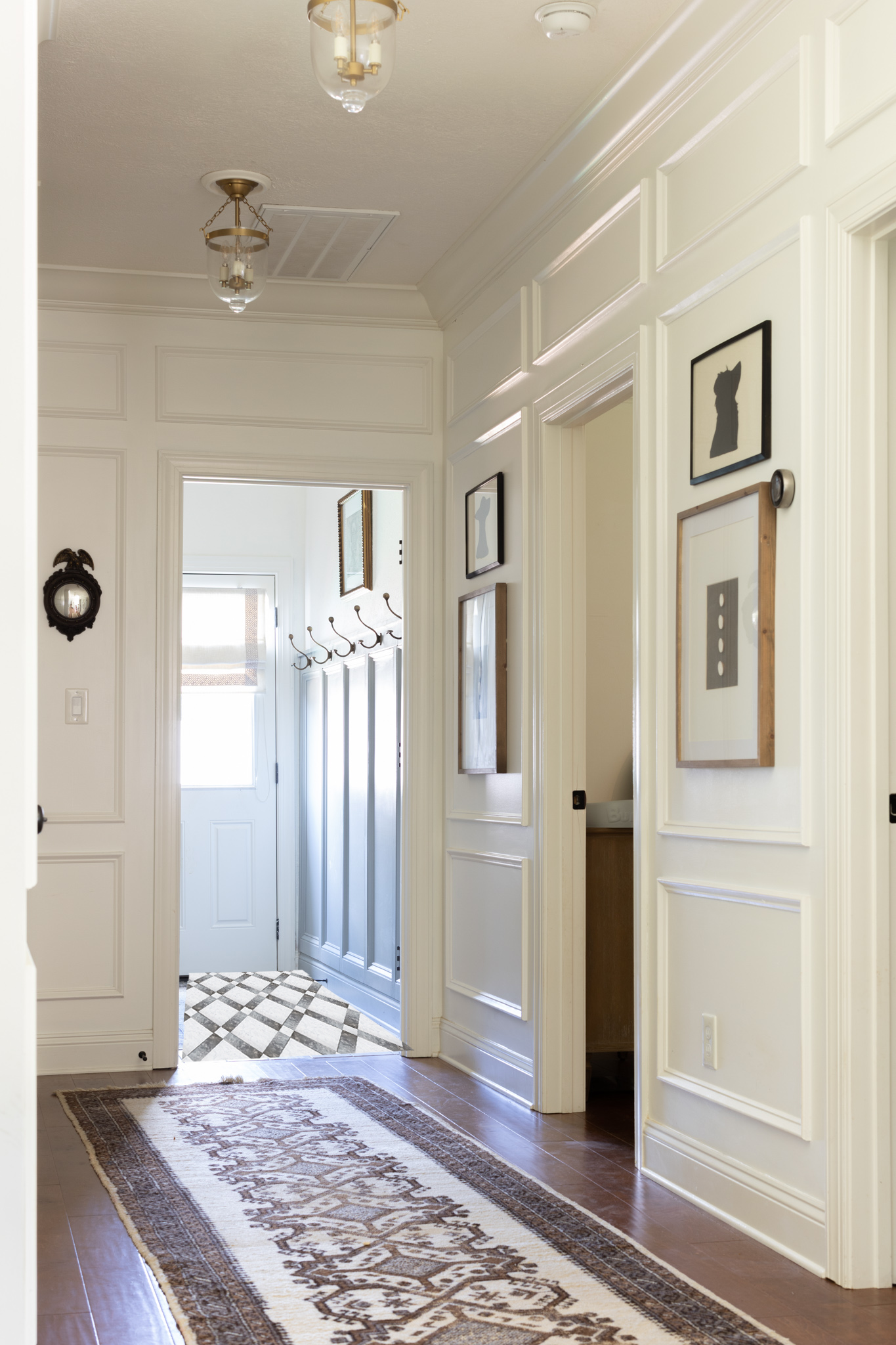
Since removing our laundry room door, I’d always envisioned seeing a fun pattern as an extension of our hallway. I felt like the checkerboard was such a nice, aesthetically pleasing way to break up the hallway from the laundry room, while still complimenting it. I thought about it more and dove even deeper on why I like this specific pattern.. even more specifically the diamond orientation vs square… And I came to this conclusion. (I don’t really know how to explain this well in words, but I’ll do my best.) The reason I am drawn to the diamond orientation specifically vs the square orientation is because of depth. It’s crazy that rotating a shape 90 degrees, gives off a completely different look and feel to the room. To me, the diamond harlequin pattern gives off a 3 dimensional feel that adds depth and extends your eye along. I think it adds another element of visual interest that a different, one dimensional pattern can’t obtain. Because of this reason, it has the ability to make a space FEEL bigger than it actually is. And who doesn’t want that?! THIS was the reason why I found myself being so attracted to this pattern. It wasn’t the checkerboard look as much as it was the 3 dimensional feeling and DEPTH.
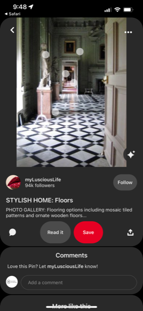
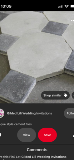
So then I thought to myself, how can I still have depth, but make something unique to us? And that is how this pattern was formed. And by formed I mean I found this image on pinterest. I did not come up with this pattern. I found it on the internet and I’m thanking the designers before me for saving me a lot of time.I like that it added a level of interest that made the space feel bigger by looking at it. I do think the pattern is a little more busy than what I am use to, BUT I also think the laundry room is a great place to try something fun and out of your comfort zone.
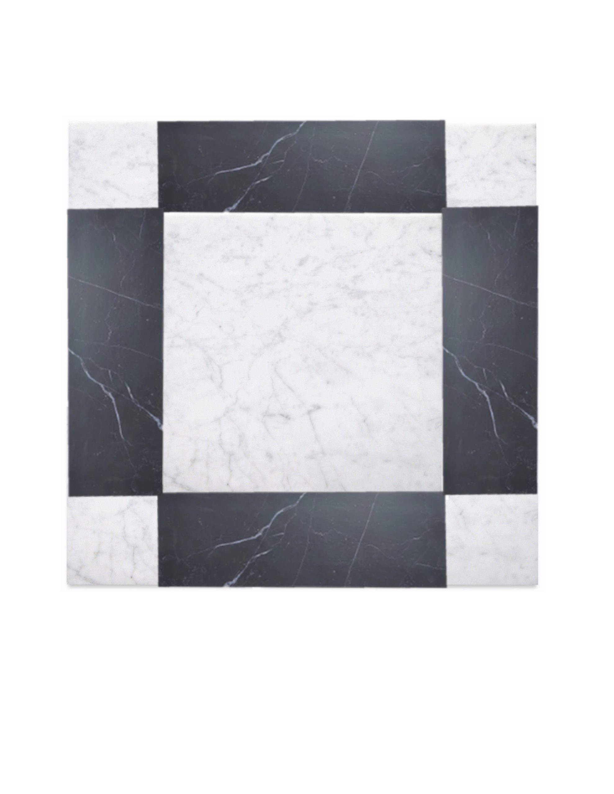
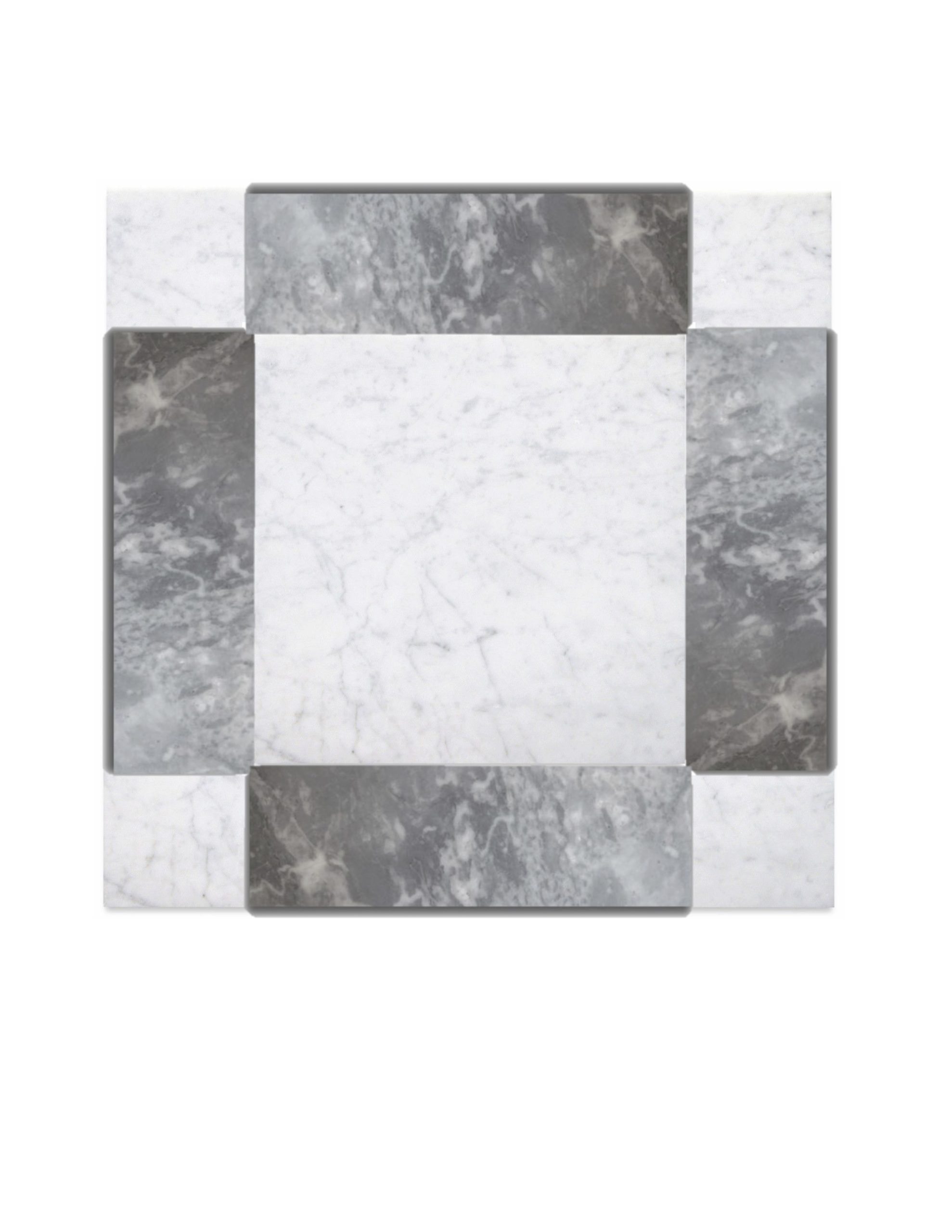
Next, I started mapping this out on our floor. This specific pattern is a 12×12 white carrara tile combined with 4 4×12 gray marble tiles and 4 4×4 white carrara tiles making the final size 20×20. I was nervous that such a big, busy pattern in such a small, narrow space would be too busy. So, I mocked it up.
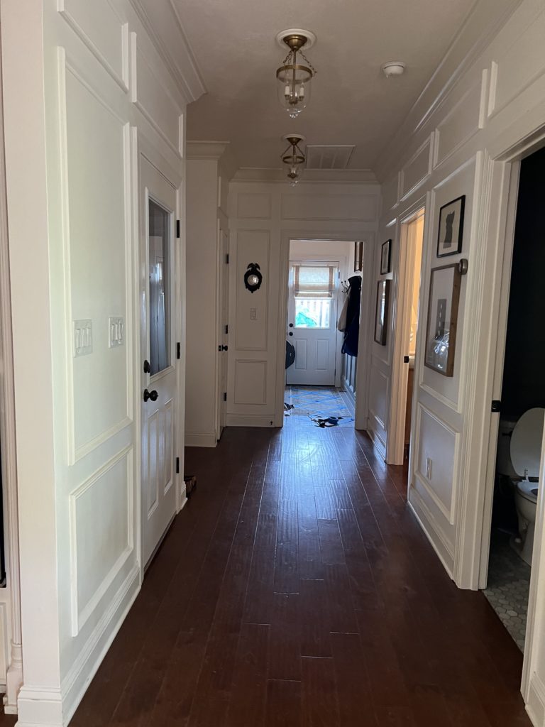
Seeing it in blue tape, it did not feel too big or busy, BUT there are 9 pieces that are supposed to go inside that piece of blue tape that we aren’t seeing. This is why mocking it up helps so much.
Turns out I LOVE it and think it’s a perfect way to define the laundry room while also still being a continuation to the hallway. Once I was decided on the pattern, the MOST difficult decision for me was deciding a color. Do I want black or gray?! I debated on this for hours and pulled Will in on it.
CHOOSING THE COLOR
We ultimately went with gray and here’s why. 1) Gray was designed with the initial mood board in the laundry room and seems to look best with our green cabinets / hook wall. 2) Black gives off a stark feeling. While it does seem to look better with our wood floors, it is almost too bold when you look it from across the room. I want the hallway to be the star of the show and have the laundry room to compliment it, not the other way around. My goal is subtle beauty. Not in your face beauty. Choosing gray lets the hallway shine and gives off less of a contrast. To me, in a good way.

If you stuck around thank you! We have a big announcement coming next week, and I can’t wait to share!
Where we discuss all things design, obviously.
DESIGN
Browse Category
For more of our latest projects, follow along on instagram at @hayden_interiors
© Hayden interiors 2021 | design & Photos by Sara Hayden
Intentional Design for Beautiful Spaces
Jackson, Tennessee
+ Show / Hide Comments
Share to: