Recently I’ve been thinking about ways I can not only inspire you to try something new, but help you see that you can make your house something special to you. I want this blog to be inspiration and a resource for you so that you can conquer simple home projects as they come and make your house your own.
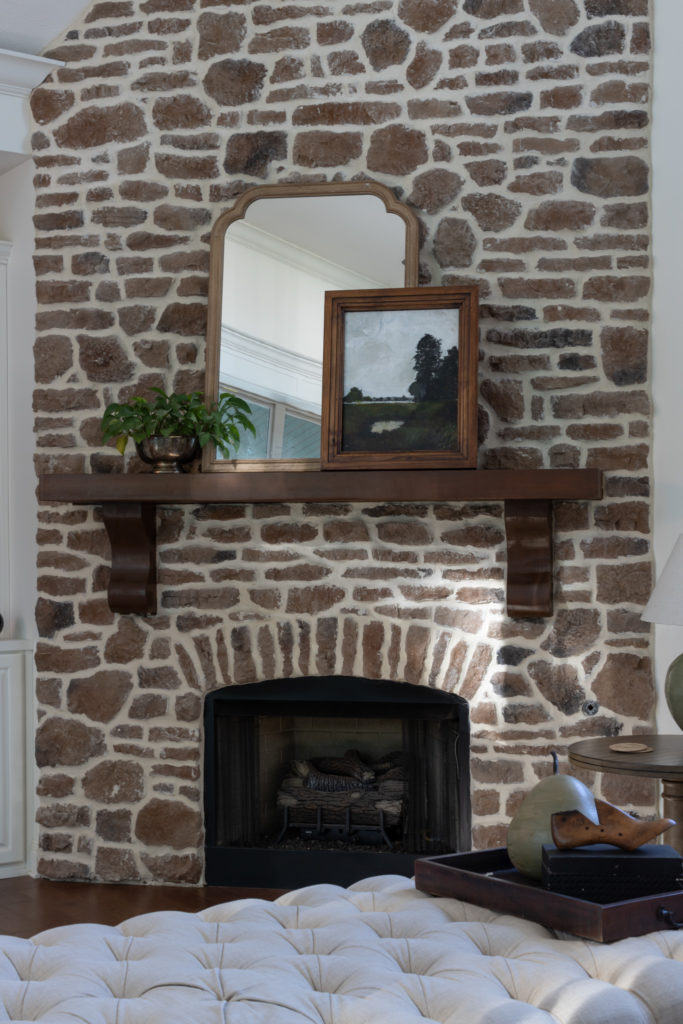
One of the biggest ways to make a space your own is with personalized art. When we think of personalized art a lot of times we think we have to be an amazing painter to put art on our walls, but that’s simply not true! Personalized art can be anything that is special to you!
My friends have sent me questions about what to do in certain places in their home that don’t serve them any function. More times than not, my answer is to ADD ART! Adding art immediately brings something that you personally love into the space. Art brings a certain standard of individuality that furnishings, fabrics, and architecture simply can’t touch. This is where you can let your unique personality shine. I always consider artwork when designing a space. Not only does it add beauty, but it brings you joy and that to me is worth a reason to try it.
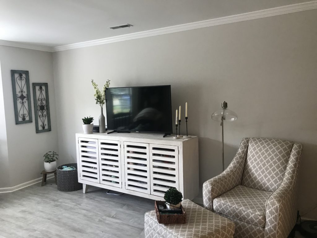
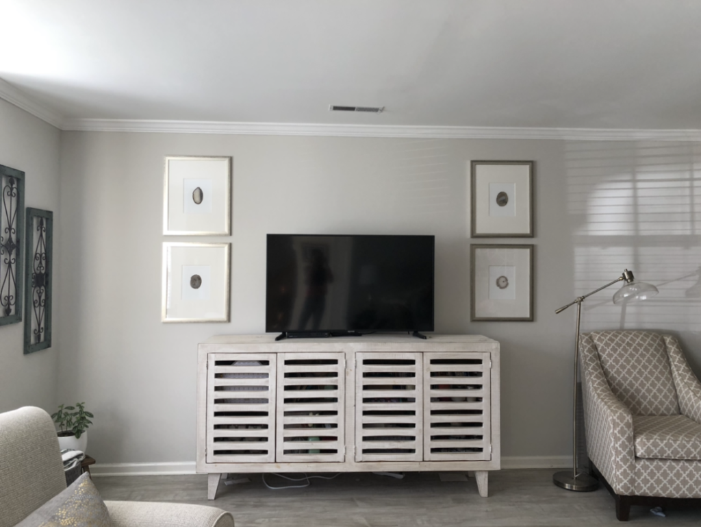
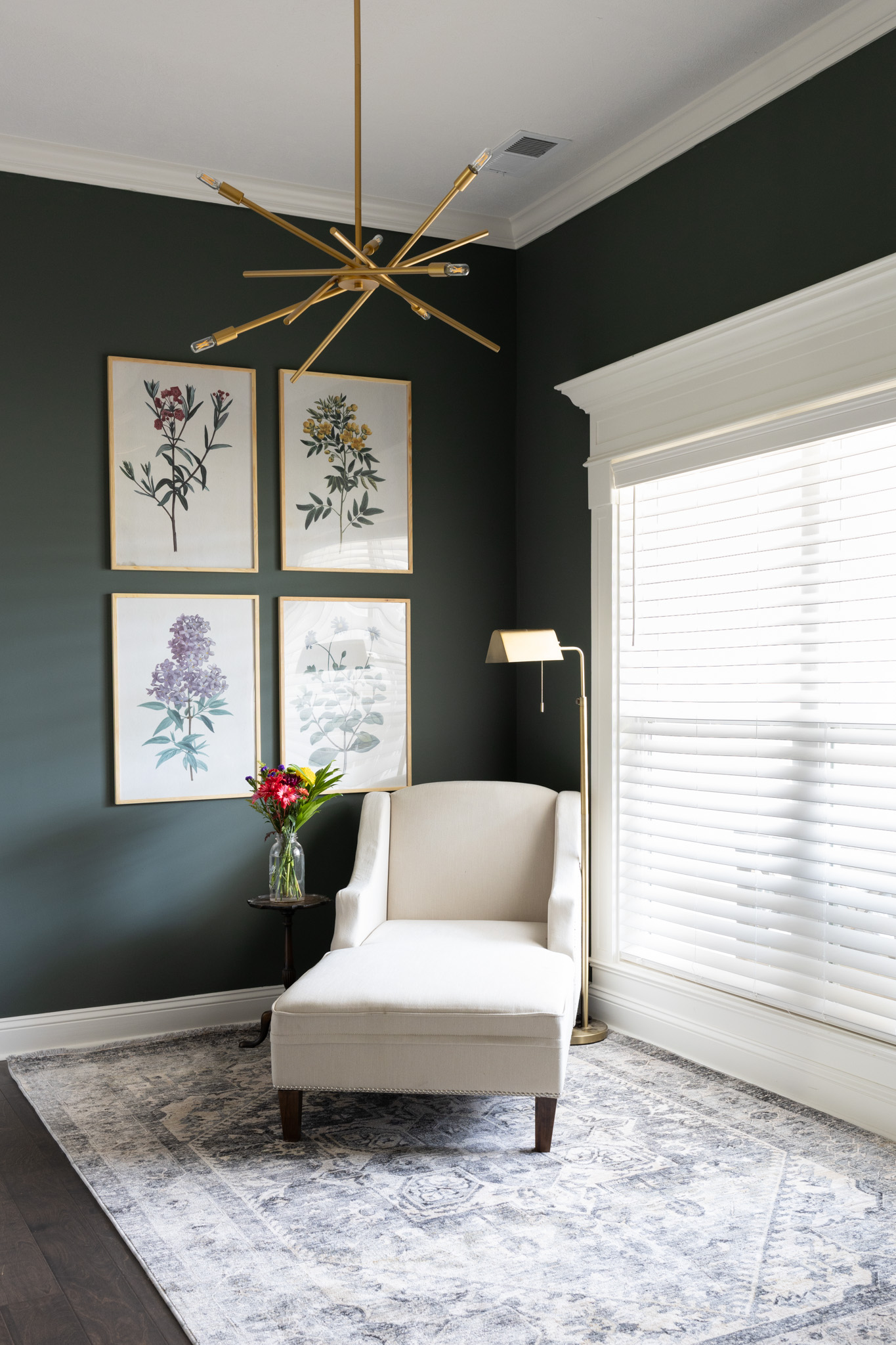
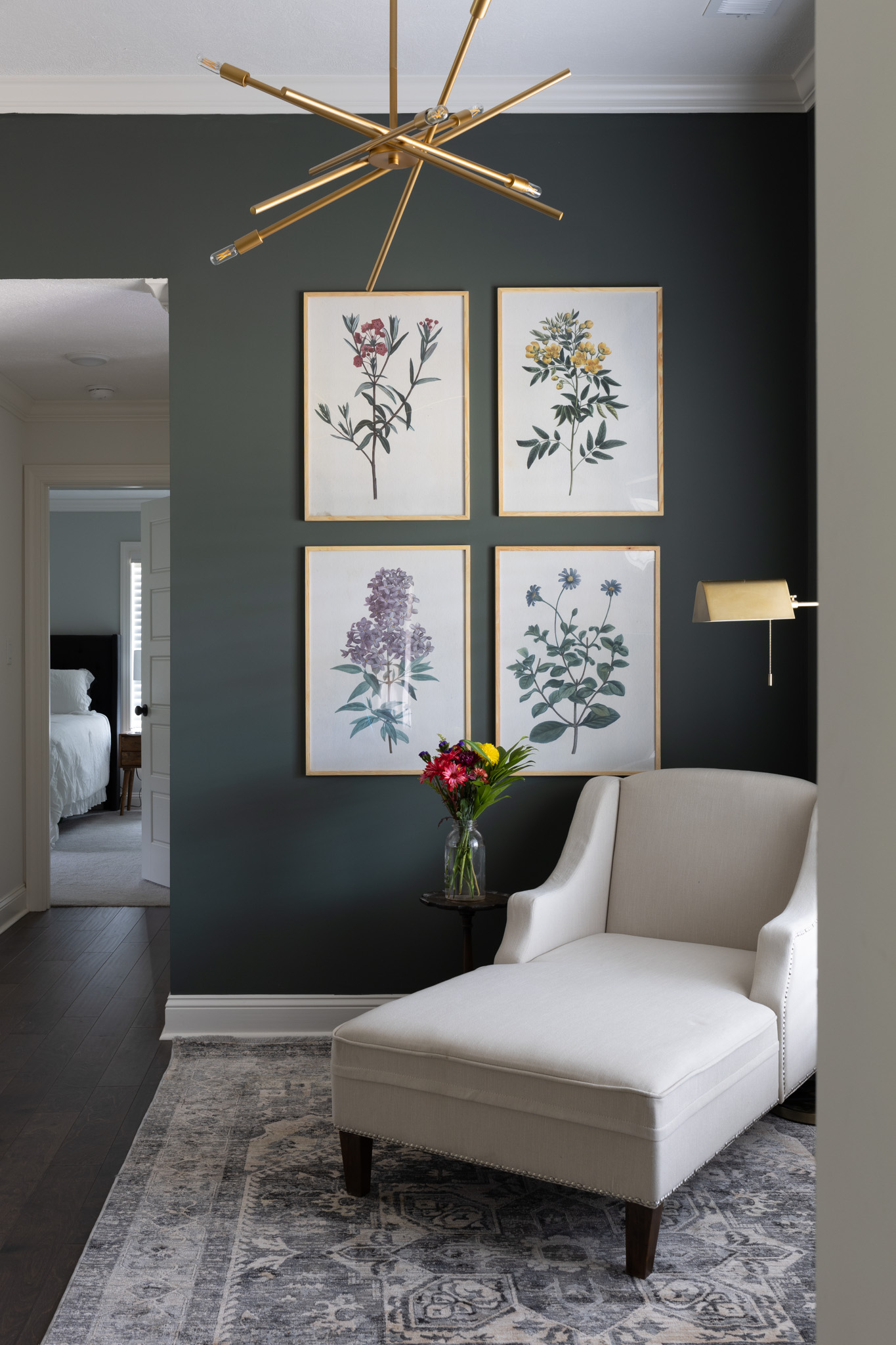
BEFORE & AFTER
Here is a before and after of a space I did for a friend about a year ago. Adding art can bring a level of sophistication that other decor simply cannot.
Artwork Configurations
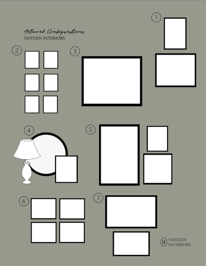
When we think about art, a lot of times we think about what goes in it, but forget about the layout. To make it easier on you, I’m sharing 7 different artwork configurations to take the guesswork out of your space. I like to use an oversized large scale art like #3 above a bed or couch because it takes up a lot of visual space. #4 would be really pretty in an entryway or places with asymmetry. I have recently been loving #7 with the unbalanced/top heavy look. In another post I will share all my large scale (6+ frame) gallery wall tips but for now keep reading to learn more tips.
Artwork Configuration Tips
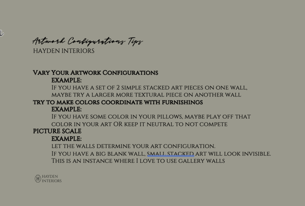
Here are some main points to consider when deciding how to lay out your art. If working in a room, I like to vary the artwork from wall to wall. In our living room, we did a combination of 1, 4, and 6 (but with a set of 2 instead of 4). This way your eyes aren’t seeing the same thing all over the place. I kept it pretty neutral so that I could play with color with our pillows. When it came to scale, I really let the space decide how large to make my art. Try not to overthink it! The good thing about art is that it’s subjective so if it makes you happy, that is all that matters.
Some Favorites of Our Home
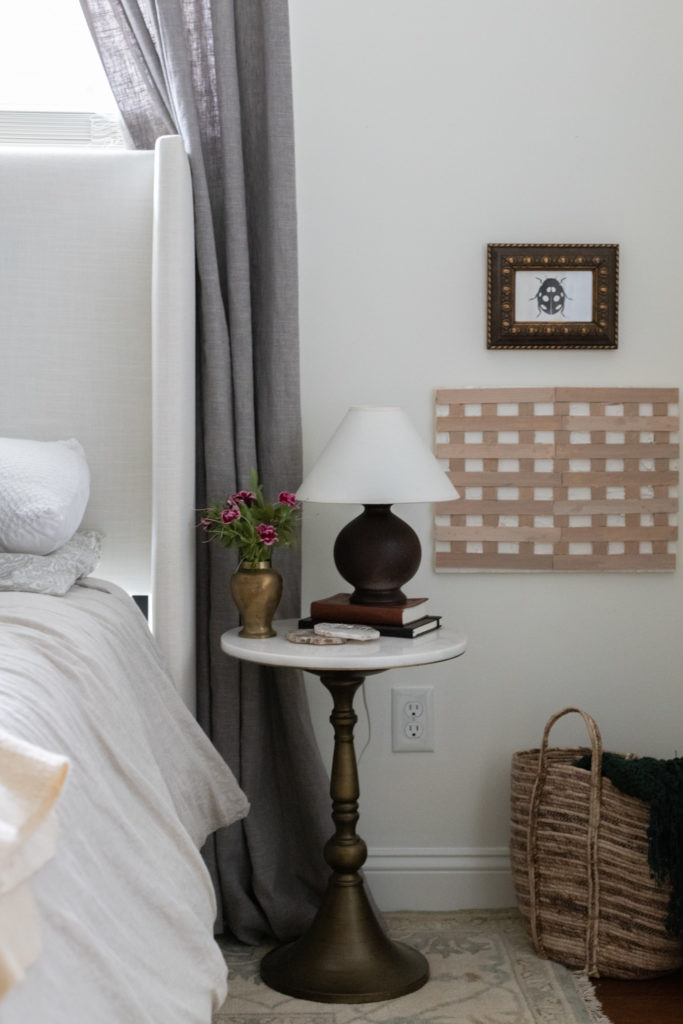
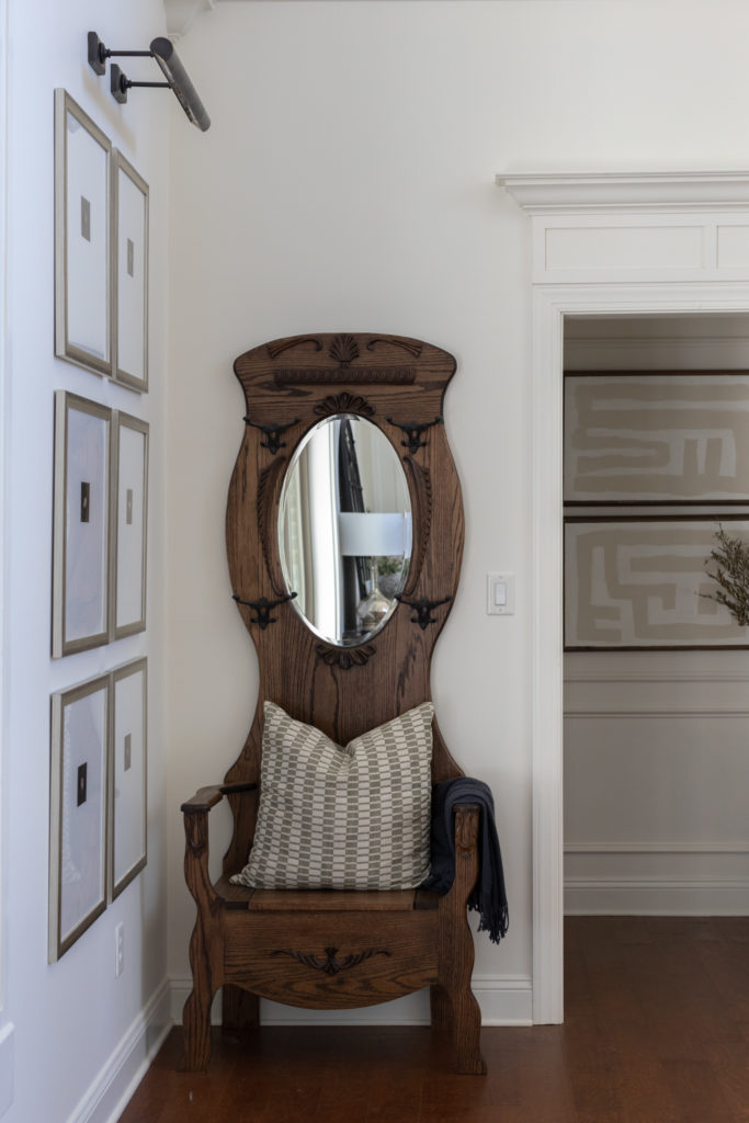
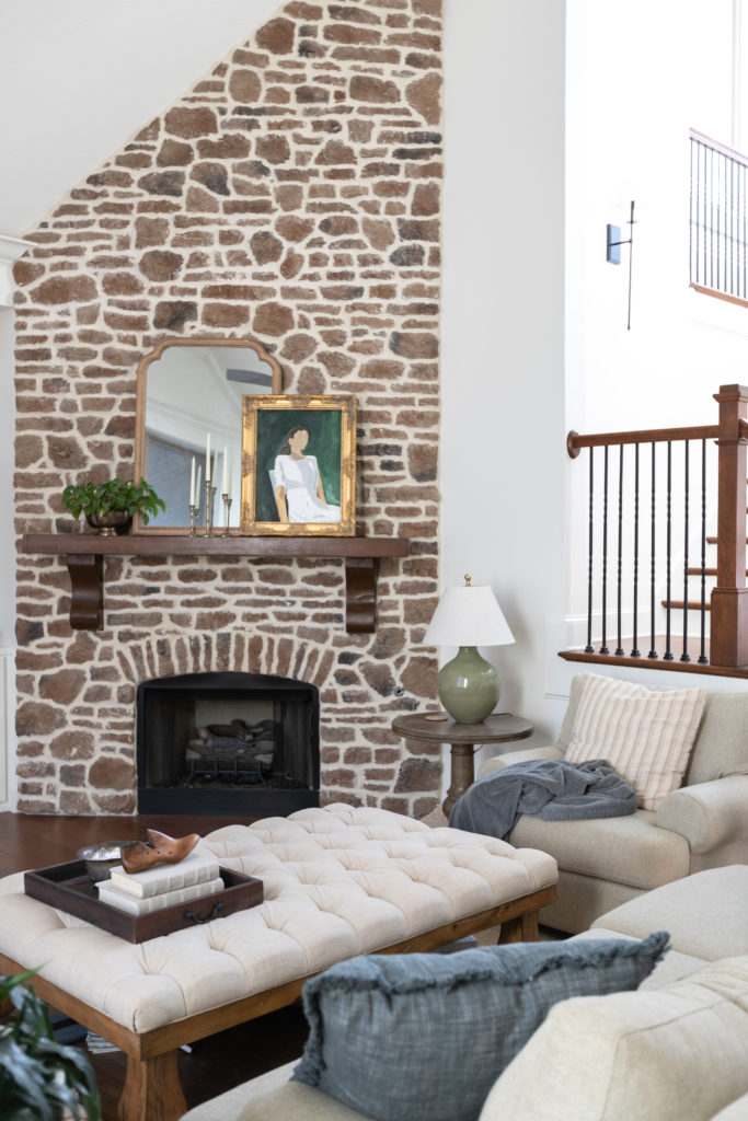
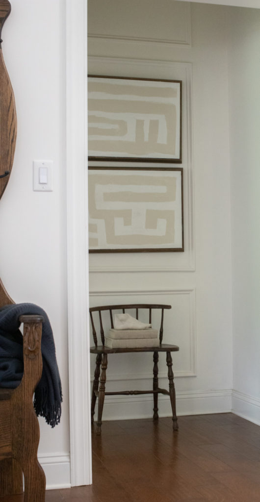
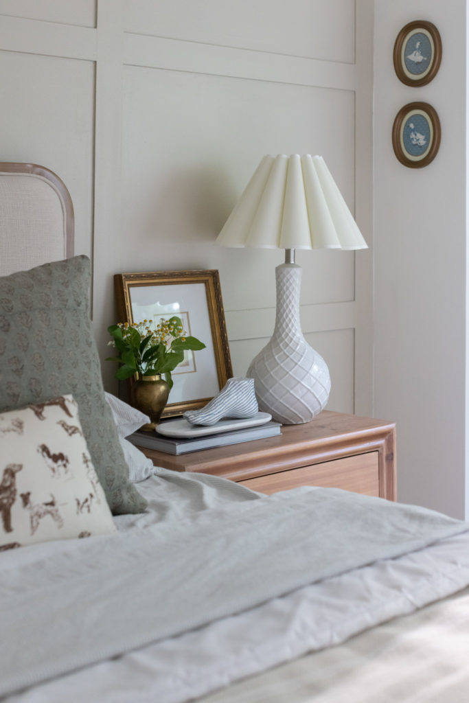
ART I’M LOVING
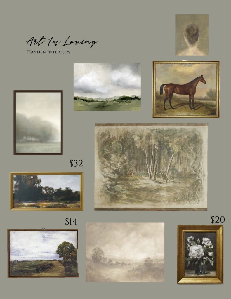
Disclaimer: This post contains affiliate links. I may receive a small comission for purchases made through these links at no extra cost to you. Just click on the bold links.
Any more questions? Did I leave one out? Have a space you’d like me to take a look at? Please share them with me! I love seeing your beautiful homes and happy to help anyway I can!
Where we discuss all things design, obviously.
DESIGN
Browse Category
For more of our latest projects, follow along on instagram at @hayden_interiors
© Hayden interiors 2021 | design & Photos by Sara Hayden
Intentional Design for Beautiful Spaces
Jackson, Tennessee

+ Show / Hide Comments
Share to: