Are you a modern farmhouse lover? It seems that people are very polarized to it. I do not think it has to be seen this way though! I think that there is definitely great beauty in this style, especially if done in a way that does not lean too “trendy”. If your opinion of farmhouse is making you want to run the other way, then actually this post is for you. If you are a farmhouse lover, then I think this post will make you love it more.
The way this mood board began was actually quite different than any other mood board I’ve done because it was for a very dear friend! I drove across the state to visit my best friend from college to catch up with her and let our kids play. They live out in the country on lots of land with a gorgeous view and have made some serious updates to their 1980-1990s home, but still really needed help on their kitchen. The space hasn’t been as functional as they’d like it to be and it was in need of some cosmetic updates as well.
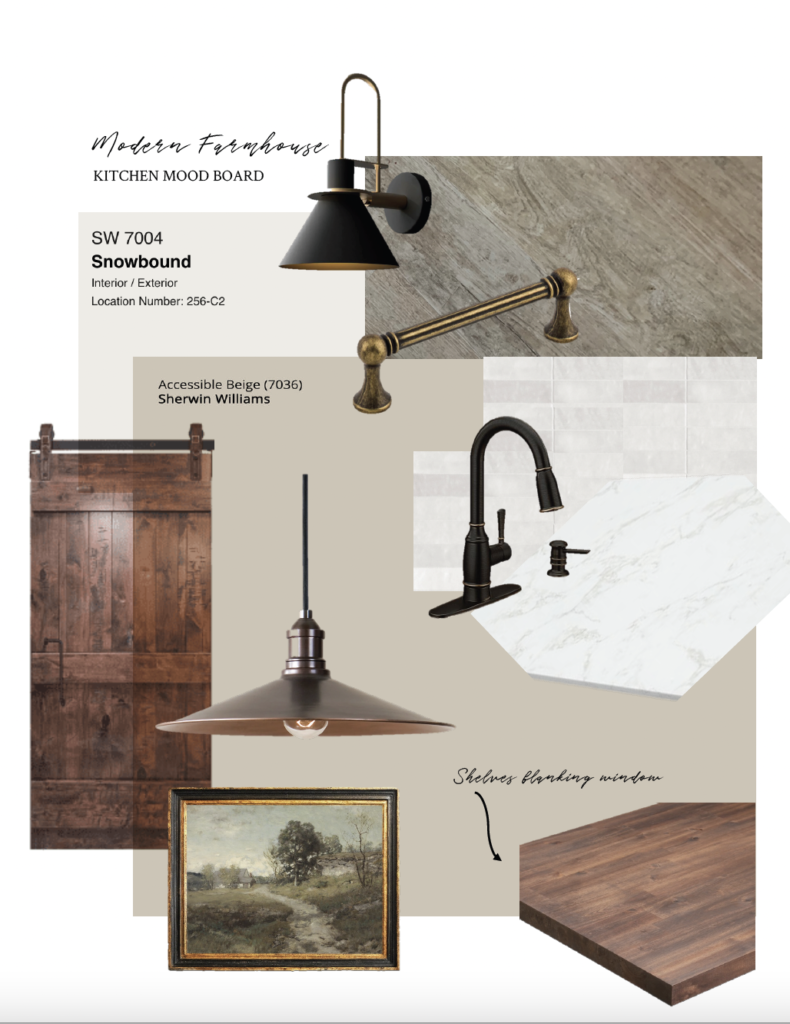
THE MOOD BOARD
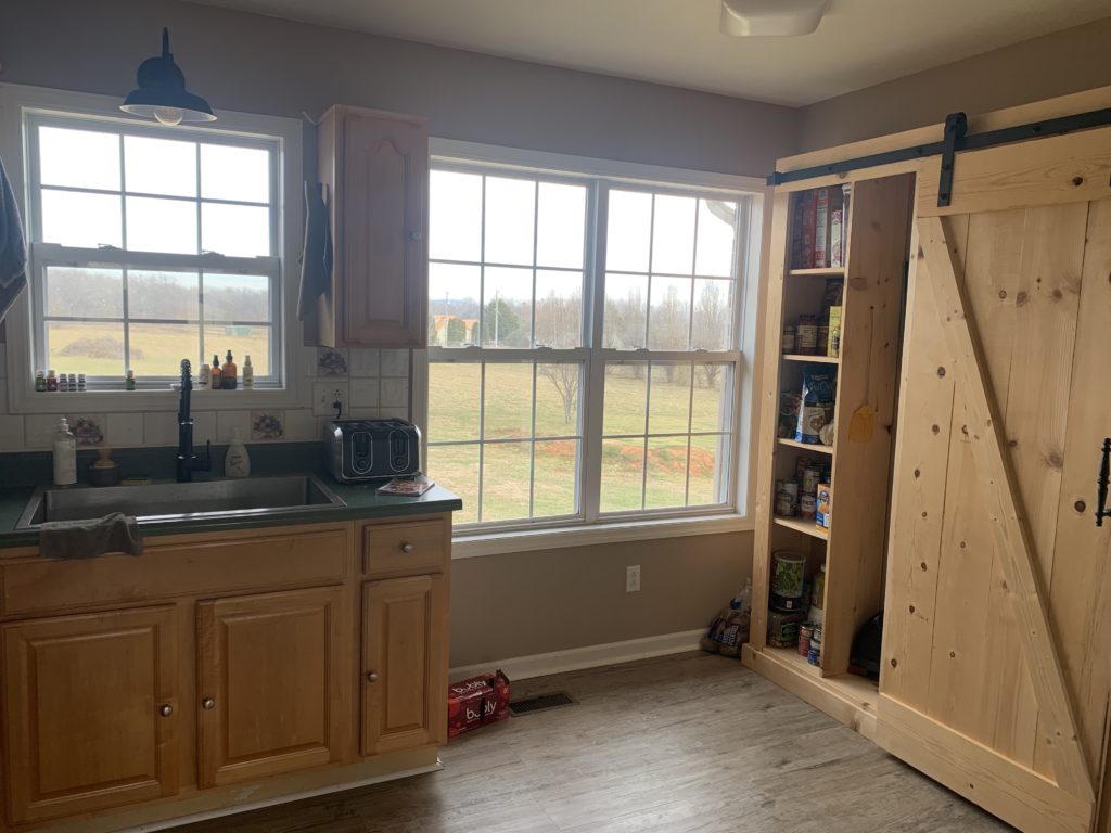
Here are some before pictures in the kitchen. As you can see, there is a lot of work to do! They have already made amazing progress by adding a barn door sliding storage shelf along the right wall. They replaced the sink and added a matte black faucet and sconce above the window. They also replaced the floors.
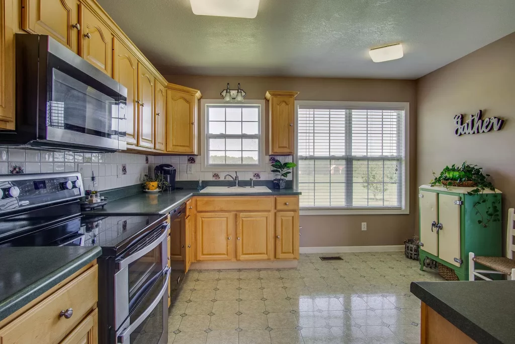
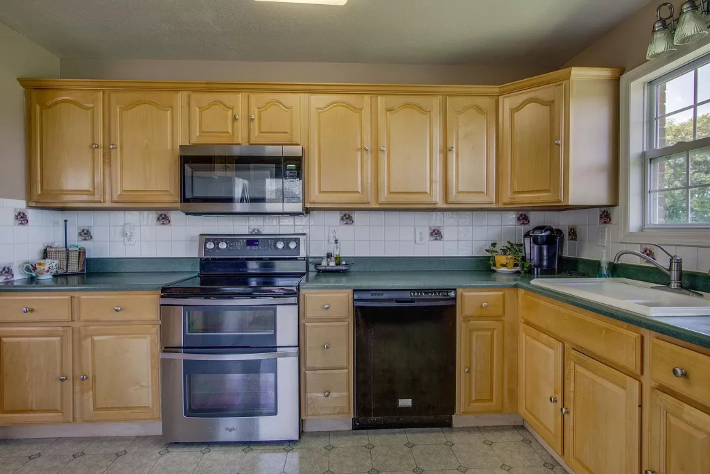
Below is what it looks like now!
THE PLAN
- Knock out cabinets on either side of the window and flank it with open shelves.
- Add cabinets on top of the existing cabinets to draw your eye up to the ceiling and add more storage.
- Paint the upper and lower cabinets.
- Stain the barn door and paint the rest of the built in same color as cabinets.
- New countertops
- New tile.
- New hardware.
- When she mentioned knocking out cabinets on either side of the window, I was in total agreement! This would open up the space and it was amazing how much more light came in the room immediately after taking the cabinet out. Hanging open shelves on each side of the window would allow that specific space in her kitchen to feel intentional and beautiful!
- Add cabinets to the top of the existing cabinets to draw your eye up. I love this look because no matter how tall your ceilings are, it makes them feel even taller.
- Paint cabinets. To me, this can make the biggest impact so we need to get it right. We knew we wanted something that would go well with her newly installed floors. See mood board. We also needed a color that would add to what she already had and not clash. A true gray seemed to clash with the floors. Black worked fine, but may feel too heavy in such a small space. We had a huge sample deck from Sherwin Williams and started playing around with neutrals. We already knew that she was choosing “Snowbound” by SW for the walls. Holding up snowbound against her wood floors, we found that “Accessible Beige” seemed to stick out in a good way. It wasn’t too warm and wasn’t too cool compared to her floors. It actually seemed to compliment it nicely. We compared other paint samples next to it but ultimately kept coming back to this one. A gorgeous neutral that compliments her floors and walls. We grabbed a sample from the local store and painted it on. It was beautiful! Enough of a contrast from the wood to set it apart. Dark enough to be distinct from the future white walls and honestly just so gorgeous.
- Stain the barn door. Now that we had floor, wall and cabinet color, it was time to find a stain to compliment and not compete. Dark walnut was perfect. It set it apart and brought in the perfect amount of warmth that the space needed.
- Countertops. This part is still undecided but any sort of white countertop would add SO much and tie all the other elements in the room together. And the beauty of white is that it doesn’t go out of style. Plus there are options out there to get white countertops for any budget.
- I personally love this ceramic subway tile. Especially with the cabinet color. It does lean more classic than modern. It is a really nice looking tile that provides a lot of texture and variation without it being too much if that makes sense. A budget friendly option would be painting over the existing tile. Since most of it is white, she could paint over just the “fruited” tiles.
- Hardware is always so fun for me! I am a huge fan of mixing metals if done in the right way. I think too much of any one thing can quickly get boring. See how we added in german bronze pulls for a collected look? Budget friendly option would be a good ole can of spray paint!

SOURCES:
PENDANT | SCONCE | CABINET PULL | ART | TILE | COUNTERTOP | BUTCHER BLOCK
SHOP THE POST
Disclaimer: This post contains affiliate links. I may receive a small comission for purchases made through these links at no extra cost to you. Just click on the bold links.
I hope this helps you see that kitchen renovations don’t have to be completely overwhelming! Picking a place to start is the hardest part. Seeing it all in a mood board really helps to understand your vision and where it’s going. This particular farmhouse style will fit perfectly into their home. Considering they live on lots of land with horses and chickens in their backyard, I can not think of a better style that fits this, actually. I can’t wait to show you all when it’s done!

YOU MAY ALSO ENJOY READING
Previous Post
Next Post
Where we discuss all things design, obviously.
DESIGN
Browse Category
For more of our latest projects, follow along on instagram at @hayden_interiors
© Hayden interiors 2021 | design & Photos by Sara Hayden
Intentional Design for Beautiful Spaces
Jackson, Tennessee

+ Show / Hide Comments
Share to: